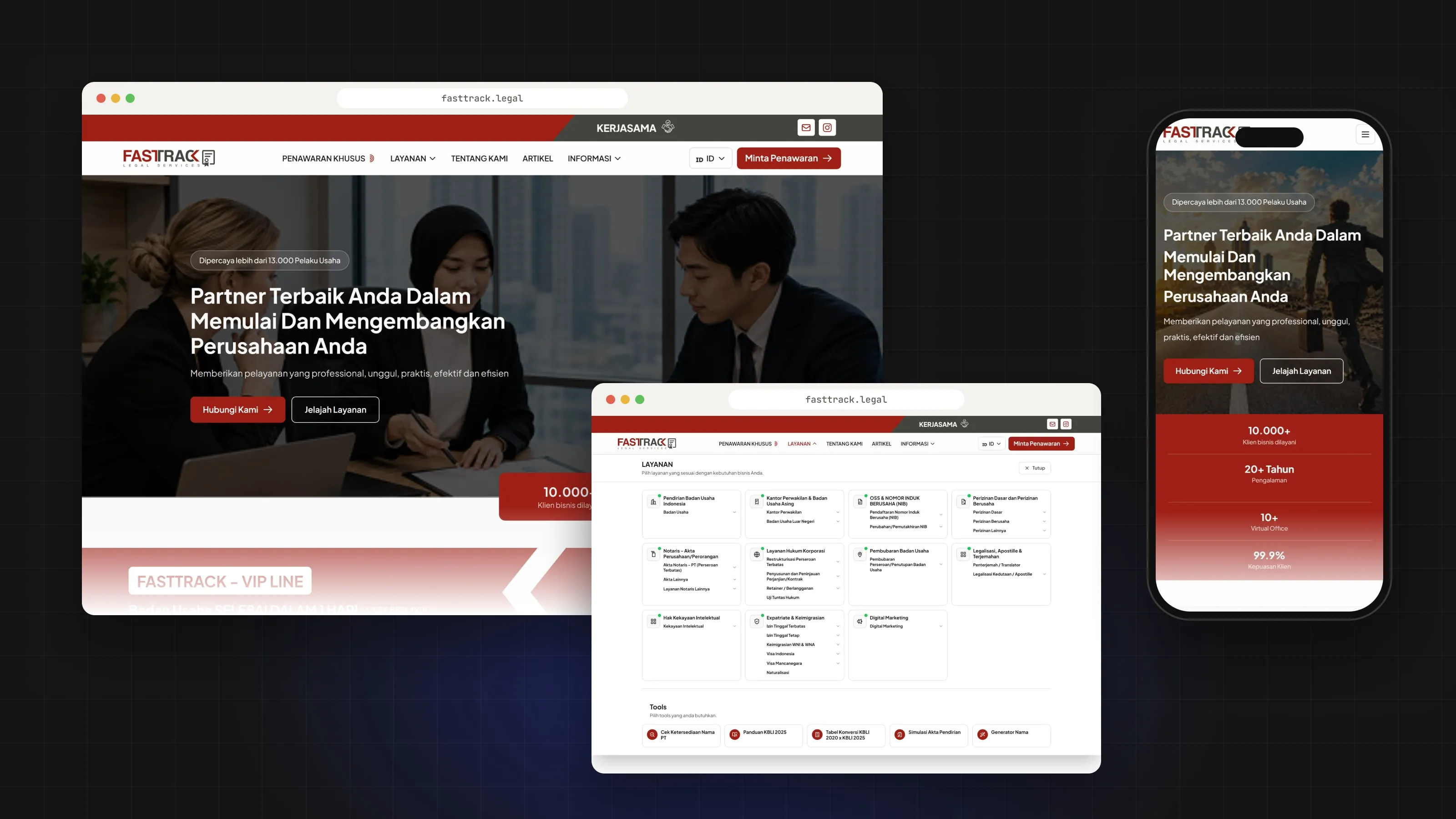
01 / Context
FASTTRACK Legal helps people and businesses set up, run and grow a company in Indonesia.
It offers company establishment, business licensing, virtual offices, notary services, visas and corporate compliance. That is a lot of services, and each one has its own requirements, documents, process and packages. The website had to explain all of it to people who are not lawyers.
02 / Problem
The content was large and kept growing. Without a clear structure, people would get lost.
- 100+ pages
- They had to fit into one information architecture.
- 25 legal services
- They needed a navigation that made sense to a business owner, not just to the legal team.
- Legal terms
- They had to be readable for people without a legal background.
- No clear path
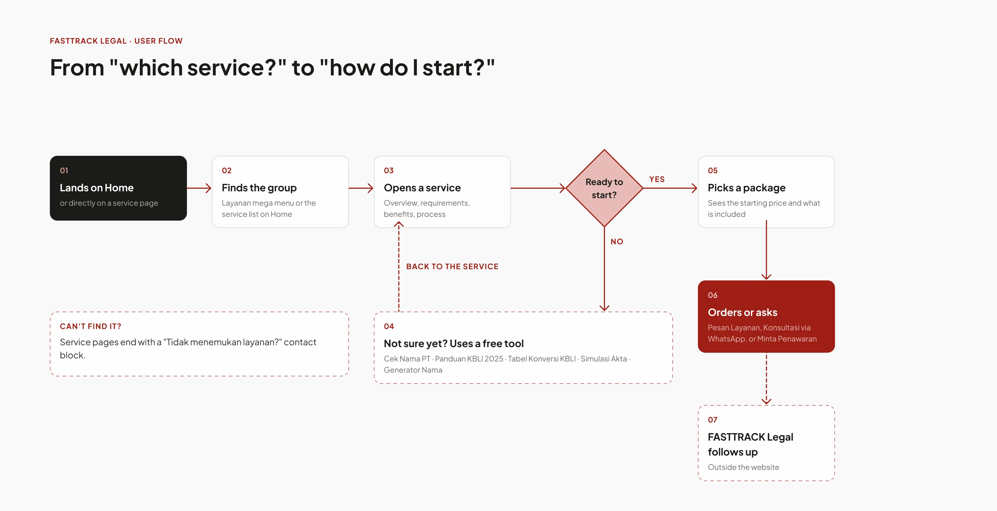
- Visitors needed a way from "which service do I need?" to "what do I prepare?" to "how do I start?".
- Early questions
- People ask the same things before the first call, like whether a company name is available or which KBLI code fits.
- Consistency
- With this many pages, every new page risked looking a little different.
03 / My role
I was the UI/UX designer on the project.
- Information architecture
- I led the structure and navigation for all 100+ pages.
- UI design
- I designed every page in Figma, for desktop and mobile.
- Component system
- I built the reusable components the pages are made from.
- Interactive tools
- I designed the 5 tools for the business establishment process.
- Collaboration
- I worked directly with the legal team on content and with the developers on the build.
04 / Process
Structure first, then pages.
- 01
Map the services first.
Before drawing any page, I sorted the 25 services around what a business owner needs at each stage: starting a company, getting licensed, and running it after that. Each service got one place in the structure.
- 02
Put the important facts first.
A legal service page holds requirements, steps, documents, prices, legal references and terms. I ordered each page so people see the key facts first, and the legal detail after.
- 03
Treat pages as a system.
I did not design 100+ pages one by one. I designed reusable components and page patterns, then built the pages from them.
- 04
Check with the legal team.
I went through service requirements, terms and business rules with the legal team, and turned them into page content and interface patterns.
- 05
Stay close to the developers.
During the build, I worked with the developers so the website matched the Figma design and stayed realistic to build.
05 / Solution
One navigation, readable pages, and tools for the first questions.
How the final site is structured.
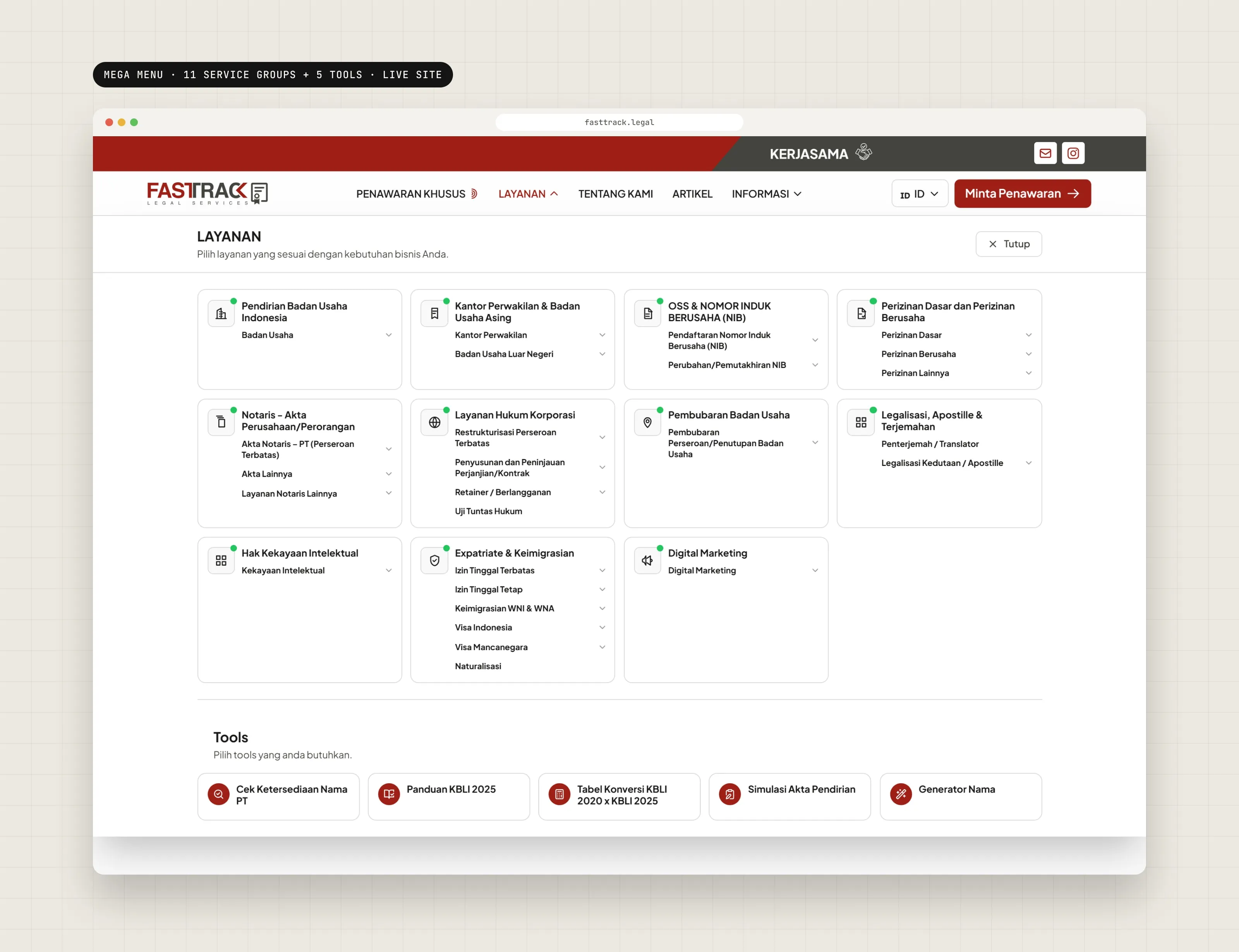
Six menu items, a mega menu with 11 service groups and 5 tools, and one page template shared by the service pages.
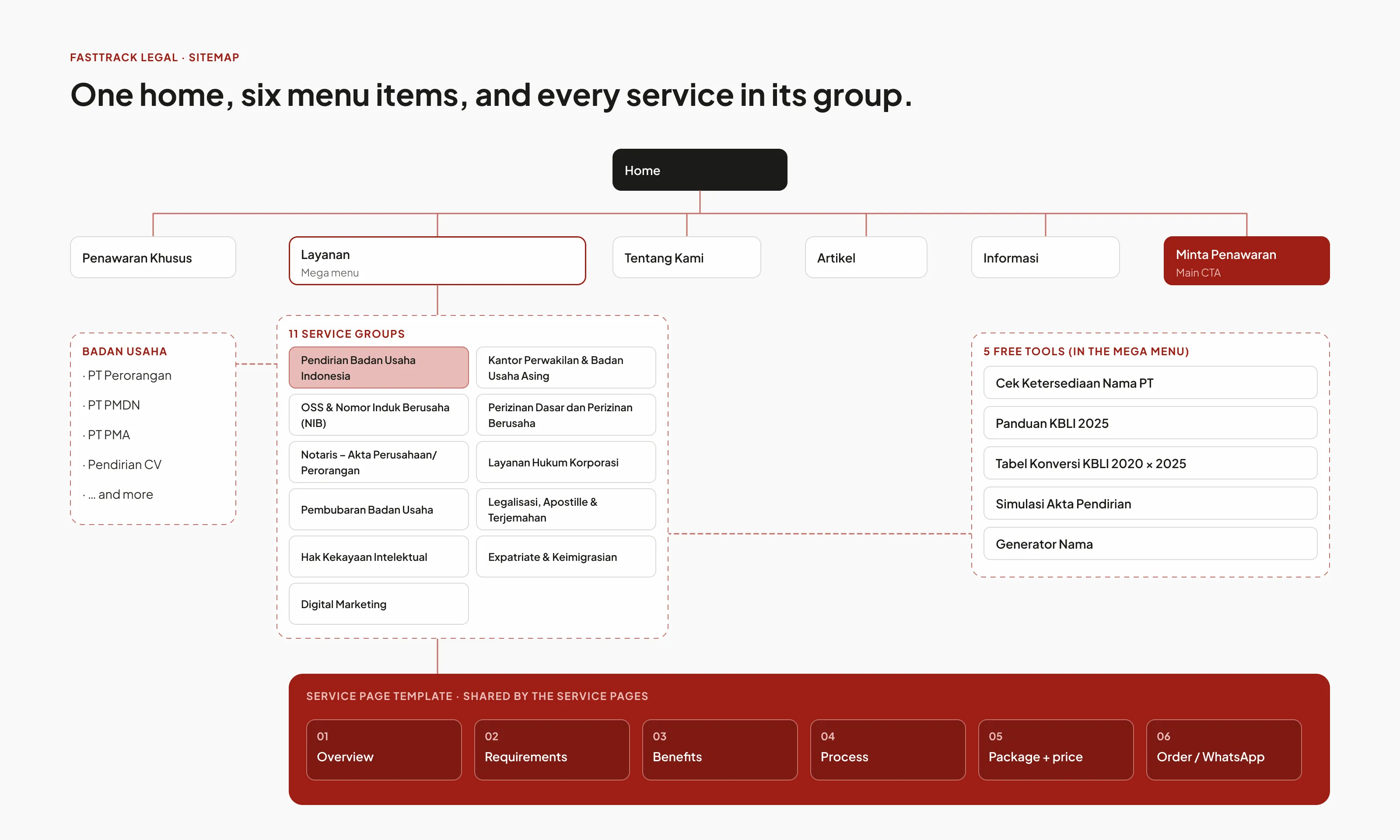
One navigation for 25 services.
The services are grouped into 11 clear groups on the live site, so people can find the type of service they need.
- Pendirian Badan Usaha Indonesia
- Kantor Perwakilan & Badan Usaha Asing
- OSS & NIB
- Perizinan Dasar dan Perizinan Berusaha
- Notaris – Akta
- Layanan Hukum Korporasi
- Pembubaran Badan Usaha
- Legalisasi, Apostille & Terjemahan
- Hak Kekayaan Intelektual
- Expatriate & Keimigrasian
- Digital Marketing
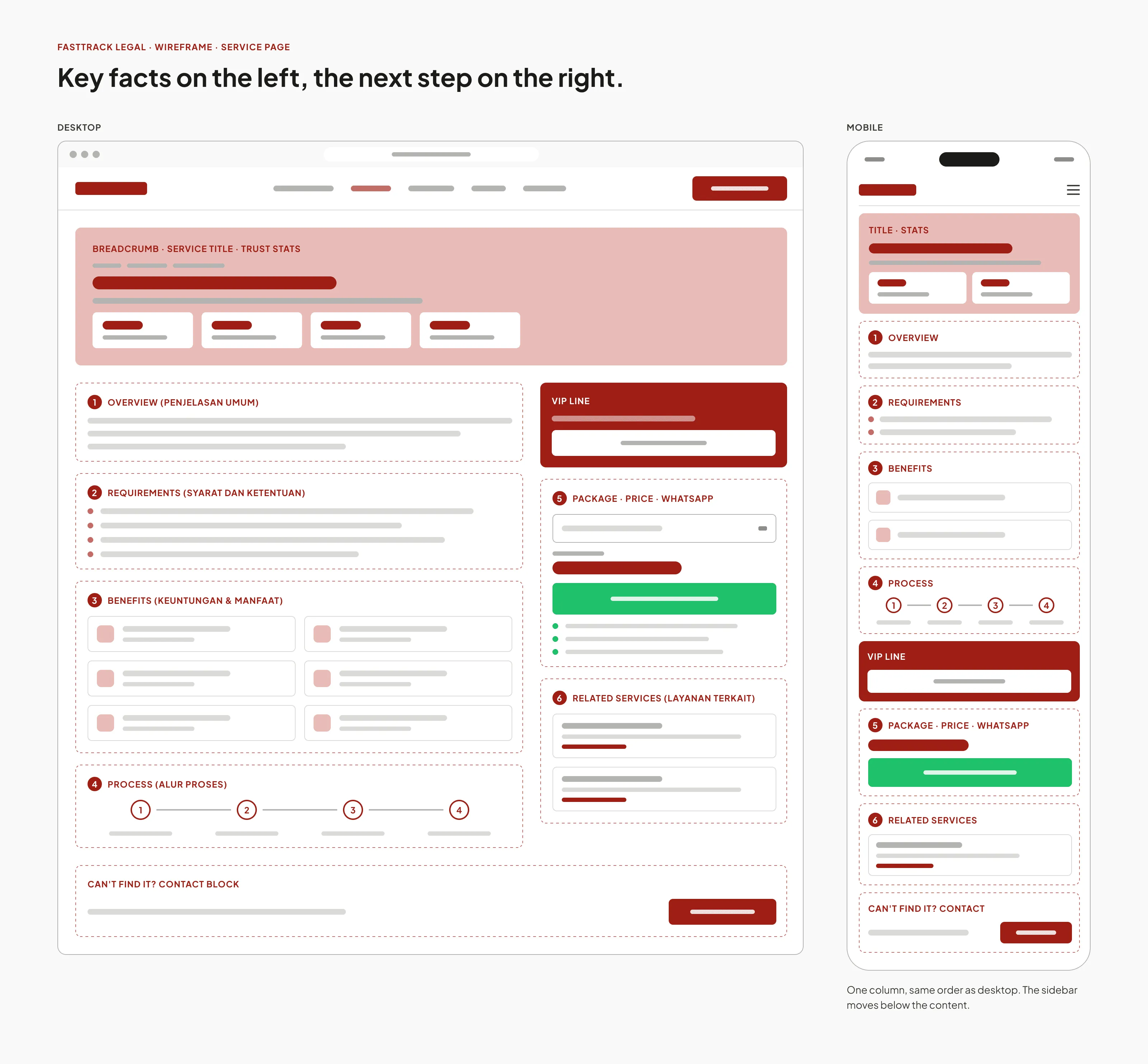
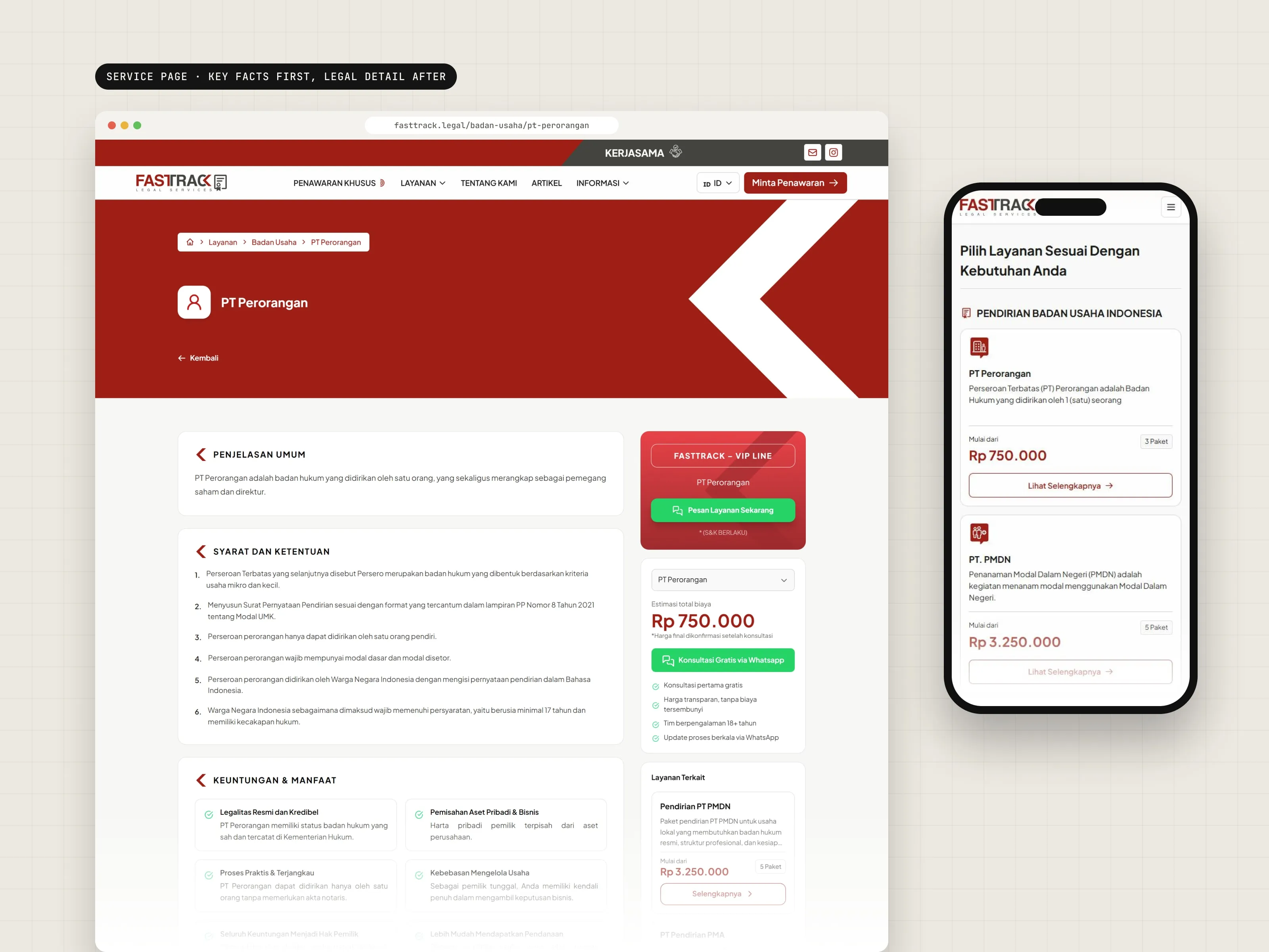
Service pages that read in order.
Each service page starts with a short overview, then the requirements, the benefits and the process steps. The price and the WhatsApp button stay in the sidebar.
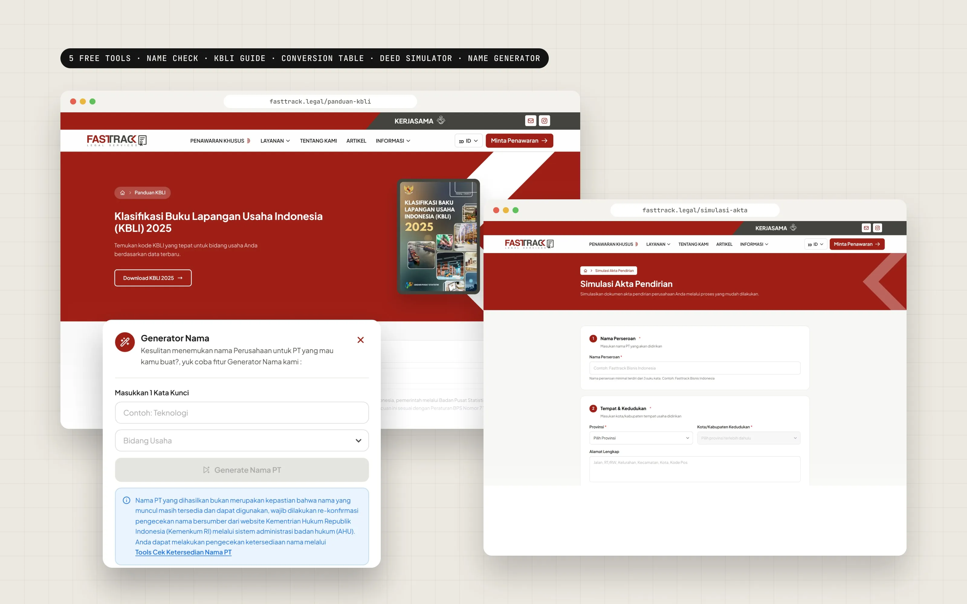
Five tools for the first questions.
These tools help people answer common questions before they talk to the legal team.
PT Name Availability Checker
Check if a company name may be available before registering.
KBLI 2025 Guide
Search for the right business classification code.
KBLI 2020 × 2025 Conversion Table
See how the old codes map to the new ones.
Deed of Establishment Simulator
Try out the information a deed needs, before the formal process.
PT Name Generator
Get company name ideas when you don't know where to start.
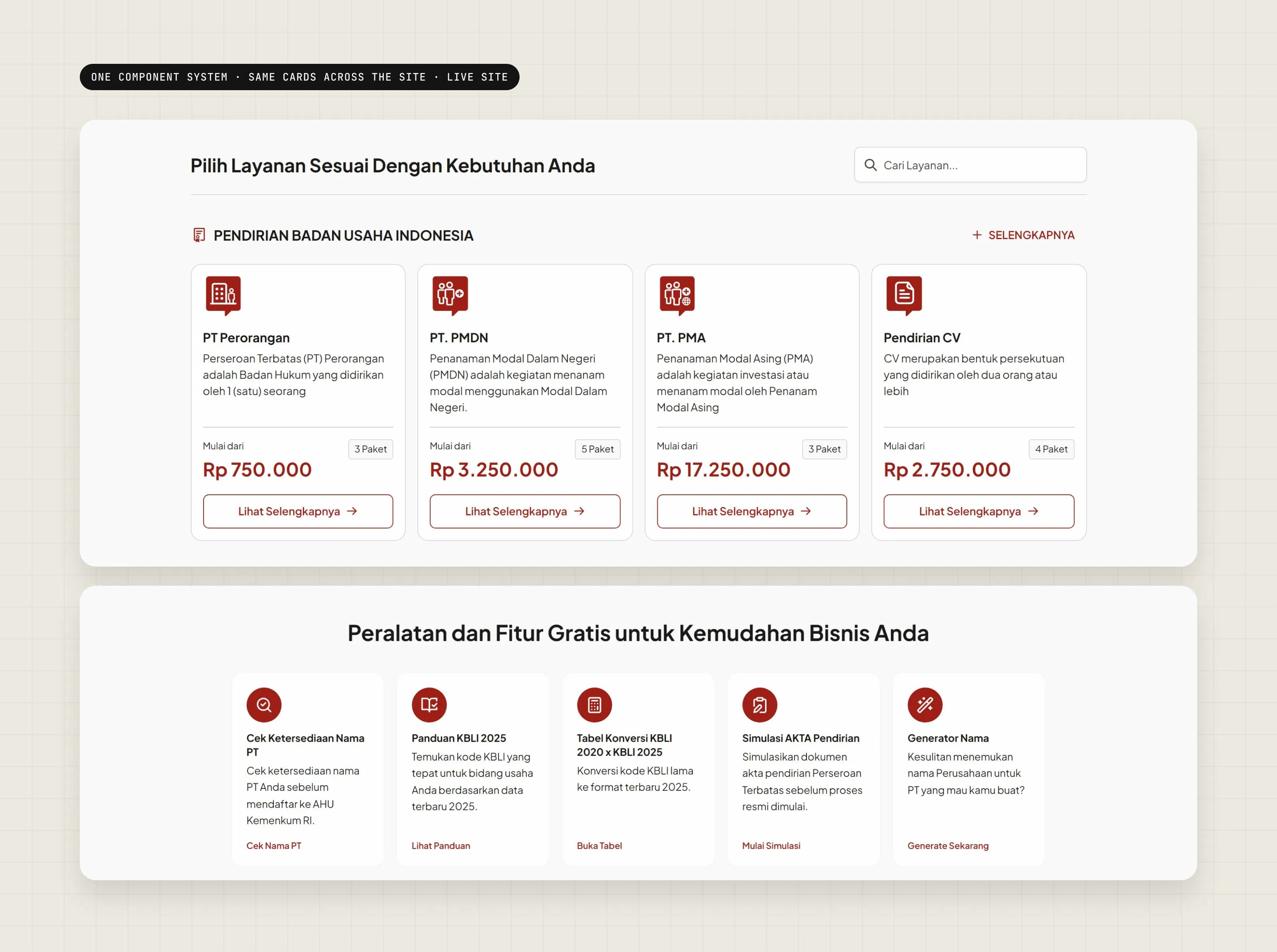
A component library for 100+ pages.
Navigation, buttons, forms, cards, service listings, pricing sections, information blocks, tables, alerts and tool components. Each page uses the same parts, so new services can be added without a new design.
06 / Result
What I handed over.
100+
pages organized in one structure
25
service types in one navigation
5
interactive tools
2
layouts for every page: desktop and mobile
1
component library behind the whole site
What I took from it
Complexity is not the problem. Unstructured complexity is.
The work was not about cutting information. It was about putting it in the right order.