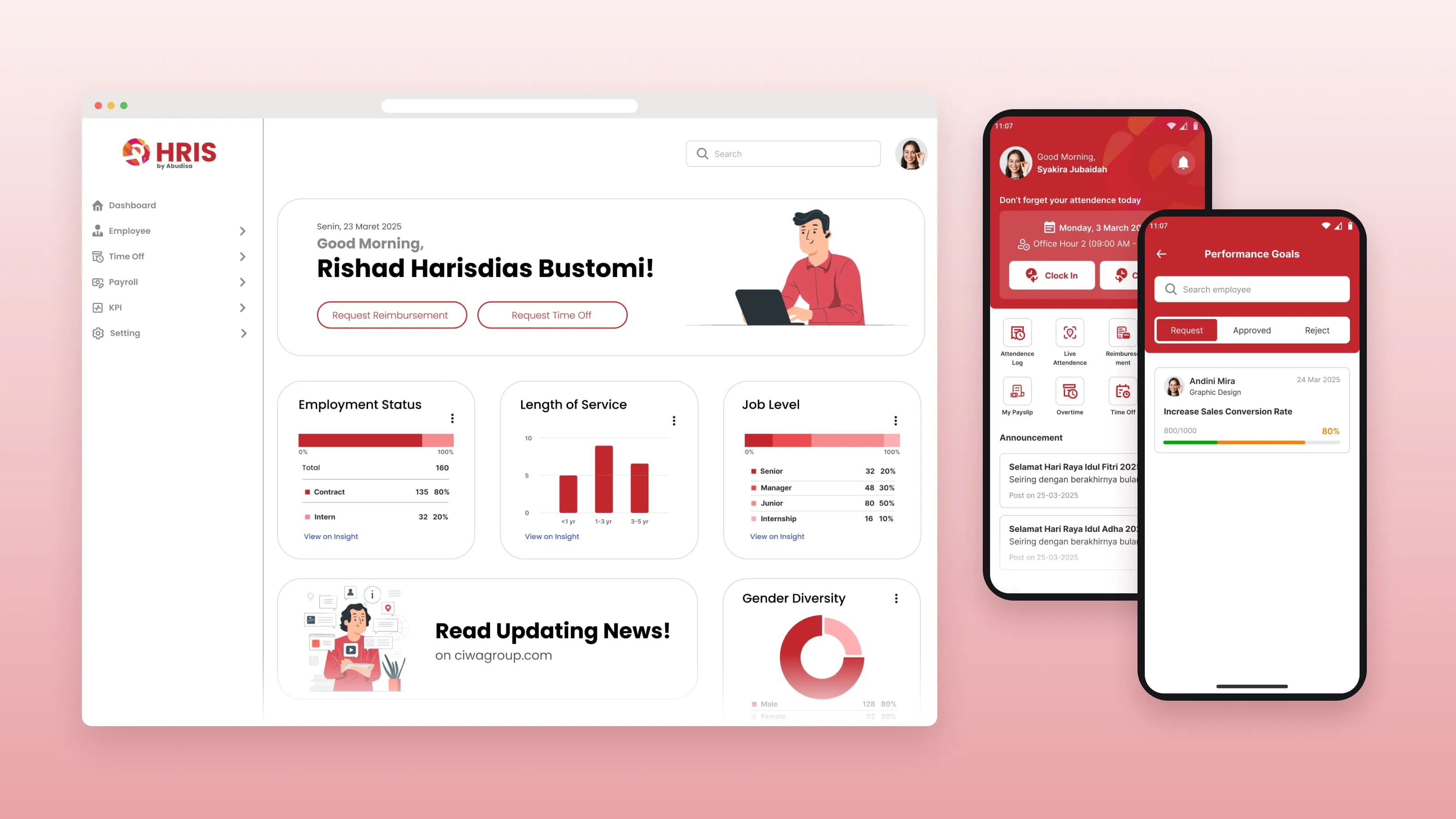
01 / Context
Bimaselindo needed one system for employee data, attendance, payroll, requests and approvals.
I designed the interface as a freelancer for PT Harmoni Mitra Tekno. The same system serves three groups. Admin and HR staff manage a lot of data every day. Employees just want to finish small tasks quickly, like checking attendance or sending a request.
02 / Problem
HR teams and employees need very different things from the same system.
- Employee data
- There was a lot of it to manage without clutter.
- Frequent tasks
- They had to be easy to reach.
- Different workflows
- Employees and HR administrators work in different ways.
- Small screens
- Employees use the system on their phones, where complex information is harder to show.
- Approvals
- Admin flows had to be clear about who acts next.
- Many modules
- They still needed to feel like one product.
03 / My role
I was the UI/UX designer, hired as a freelancer.
- Roles
- I mapped the needs of Admin, HR and Employee users.
- Structure
- I designed the user flows and information architecture.
- UI design
- I designed wireframes, interactive prototypes and high-fidelity UI in Figma, for web and mobile.
- Benchmarking
- I benchmarked established HRIS products.
- Feedback
- I worked through several rounds of stakeholder feedback.
04 / Process
Learn the familiar flows, then map each role.
- 01
Learn the familiar flows.
I studied how established HRIS products, such as Talenta by Mekari, structure common HR tasks. I used them to understand what users already expect, not as a visual reference.
- 02
Map each role.
I listed what Admin, HR and Employee users are responsible for, and what they do most often. That became the user flows and the structure of the product.
- 03
Group the workflows.
Employee management, attendance, requests, approvals and payroll were organized into clear sections, so each role sees the tasks that matter to them.
- 04
Iterate with stakeholders.
I moved from wireframes to prototypes to high-fidelity UI, and refined the design over several rounds of feedback.
05 / Solution
Desktop for HR, mobile for employees.
The right device for each role.
Admin and HR users get a desktop experience for managing broader operational information. Employees get a mobile experience for everyday HR tasks.
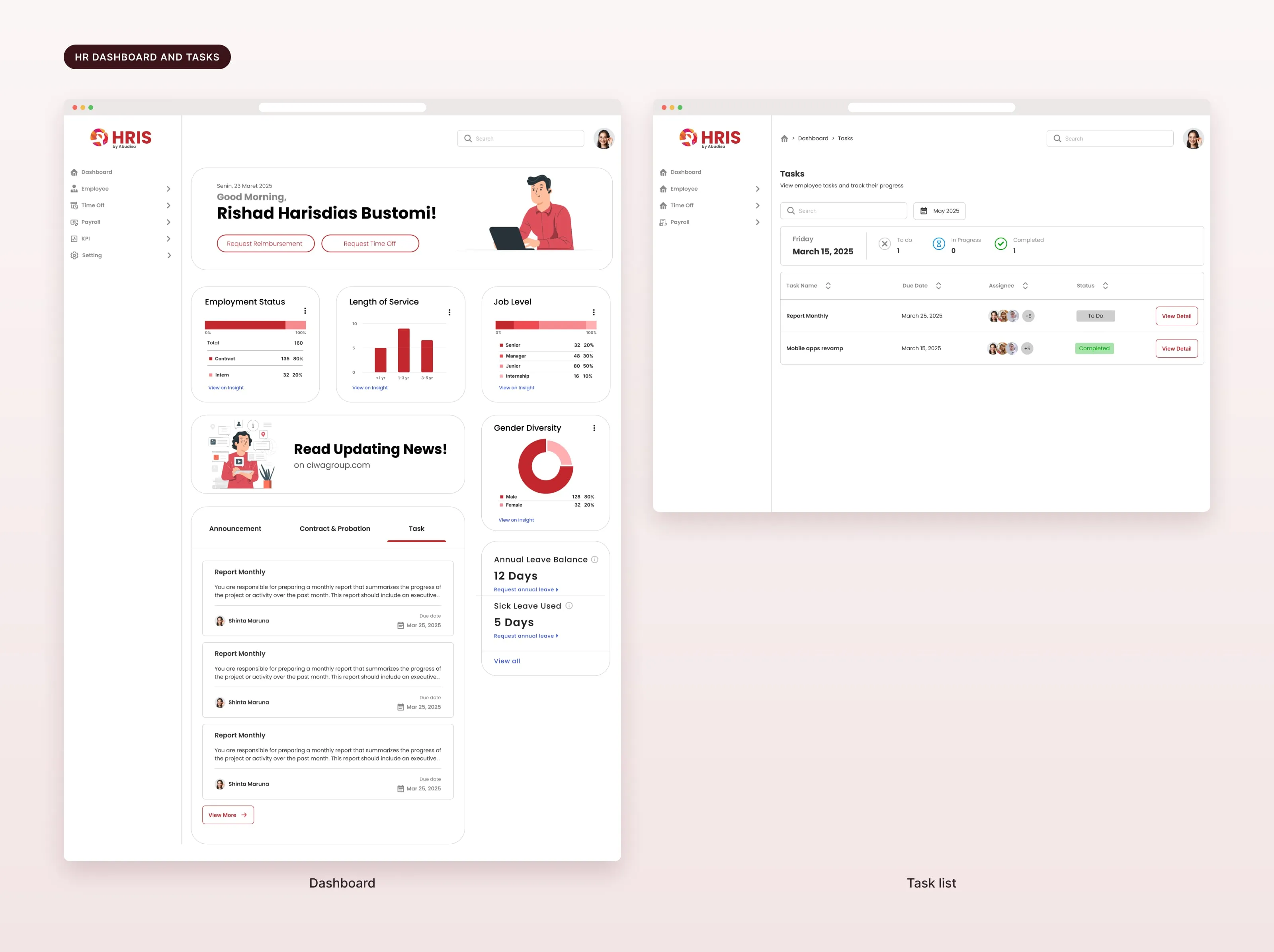
A dashboard for HR.
Employment status, length of service, job level and gender diversity at a glance, with leave balances, tasks and quick actions for reimbursement and time off.
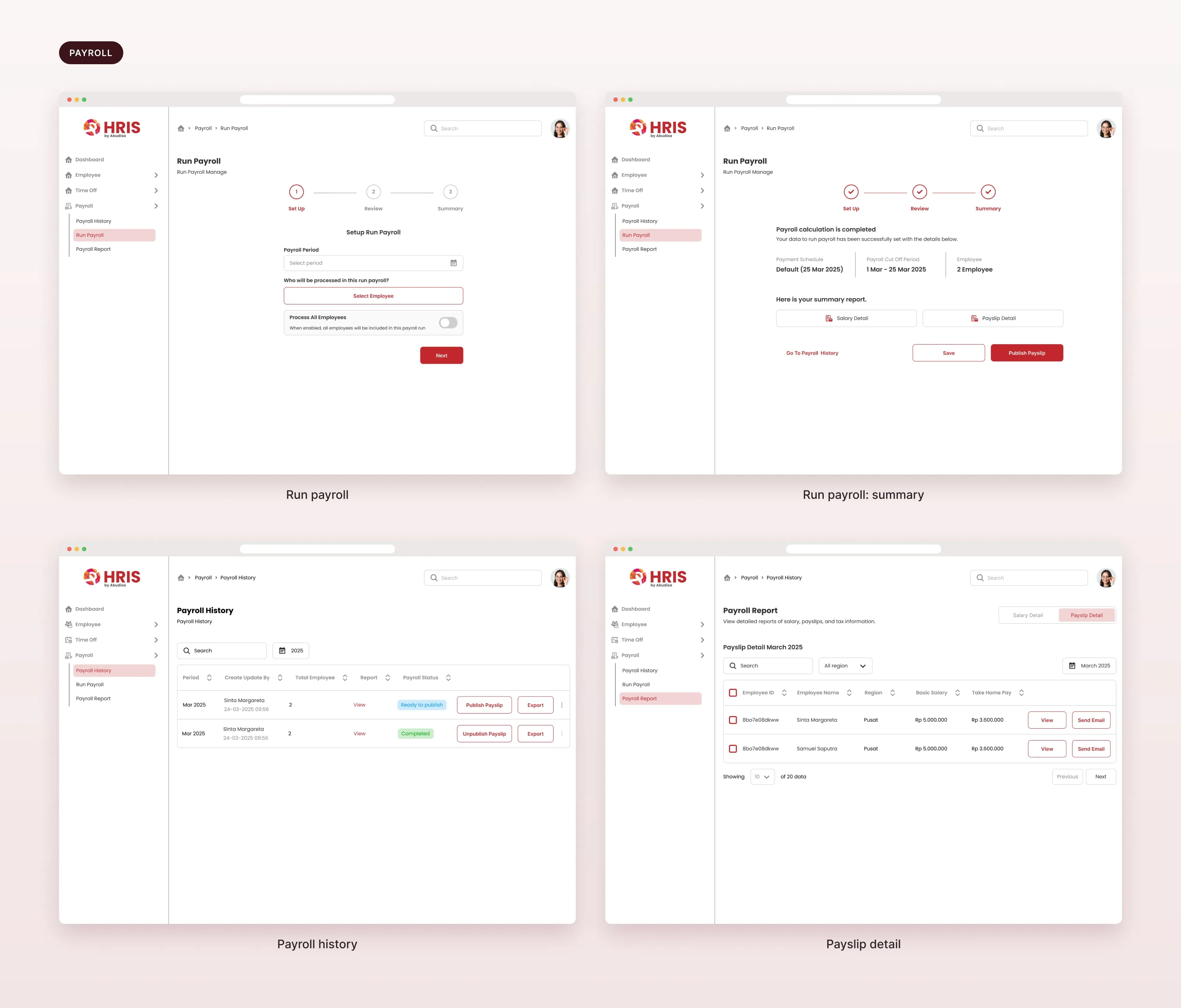
Payroll in three steps.
Set up, review, summary. HR picks the period and the employees, checks the numbers, then publishes payslips. Payroll history and payslip details are one click away.
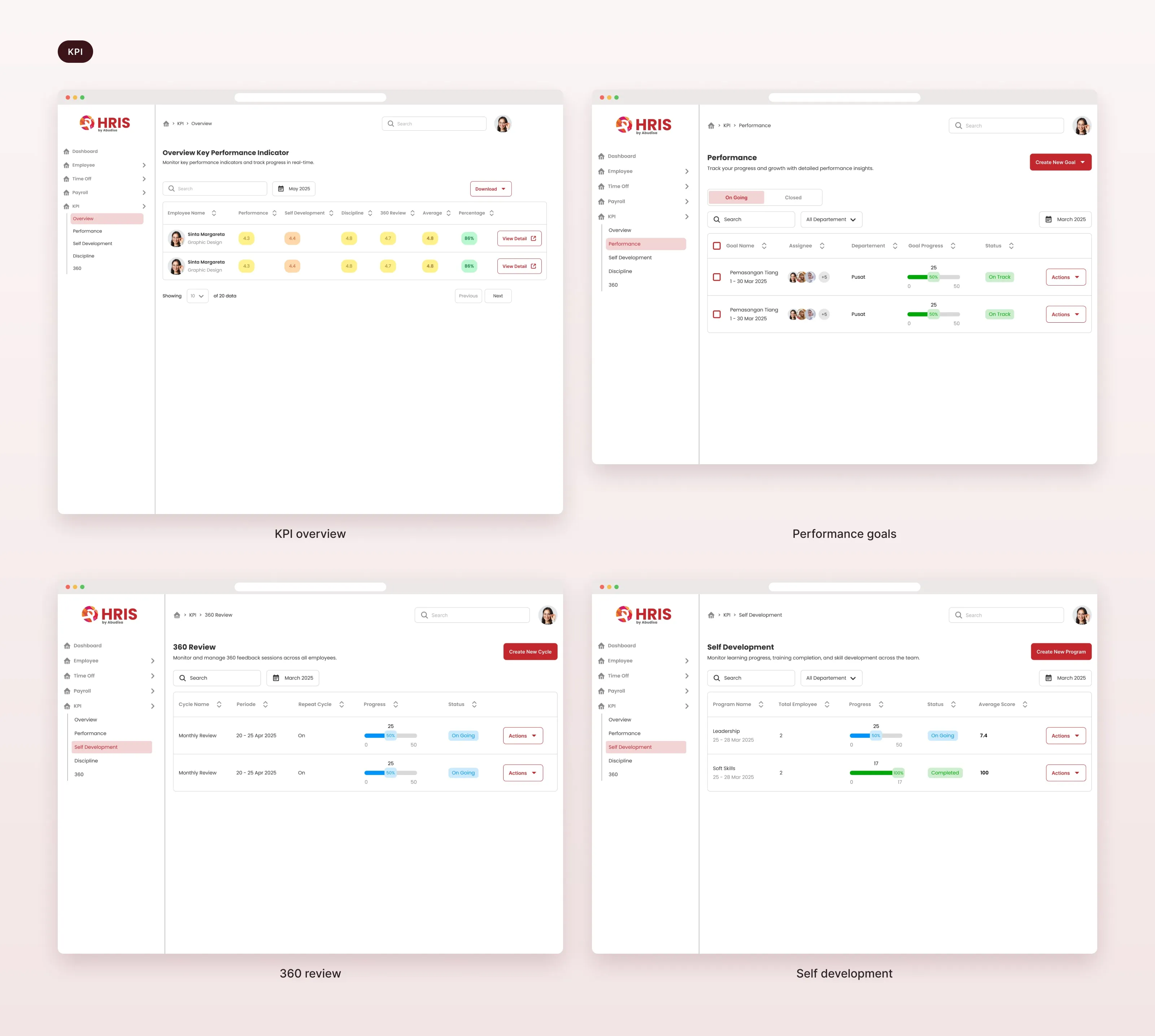
KPI in one place.
An overview per employee, performance goals with progress, 360 reviews and self-development programs.
An employee app for everyday tasks.
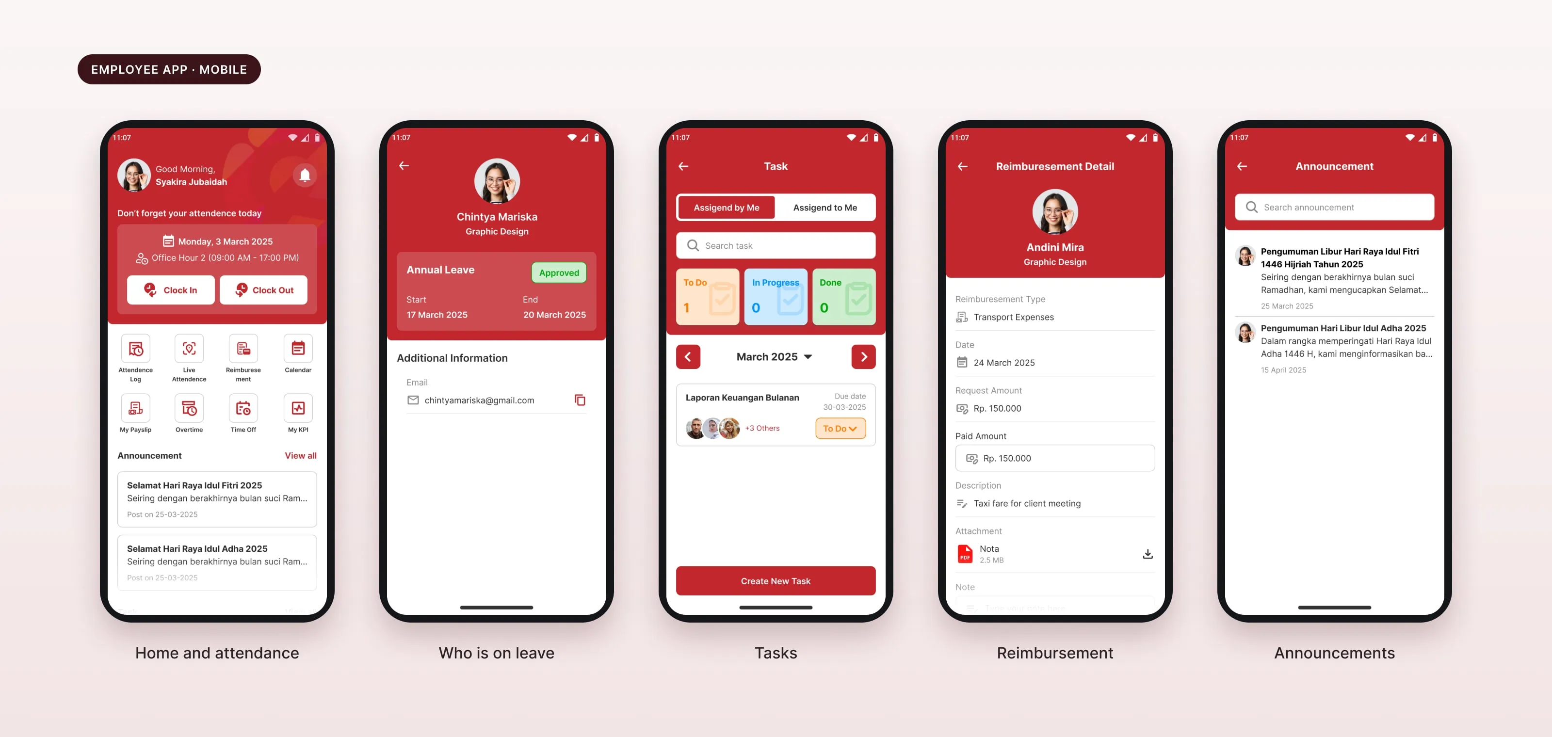
Clock in and out, see who is on leave, manage tasks, request reimbursement and read announcements, all from a phone.
Familiar flows, a new interface.
The workflows follow patterns HR users already know. The visual design is new: stronger hierarchy, cleaner layouts and consistent spacing.
One component system.
Reusable components and patterns in Figma keep every module consistent, and make it easier to add new HR features later.
06 / Result
What I handed over.
3
user roles: Admin, HR, Employee
2
platforms: web and mobile
1
component system
- Coverage
- One HRIS for employee data, attendance, time off, reimbursement, tasks, payroll and KPI.
- Returning client
- PT Harmoni Mitra Tekno hired me again for the Super App IoT.
What I took from it
Familiar patterns are a good base.
A redesign does not have to reinvent the workflow. Better hierarchy and clearer layouts do the rest.