01 / Context
Smart home users often juggle several apps: one to control devices, one to buy them, and a phone call to get them installed.
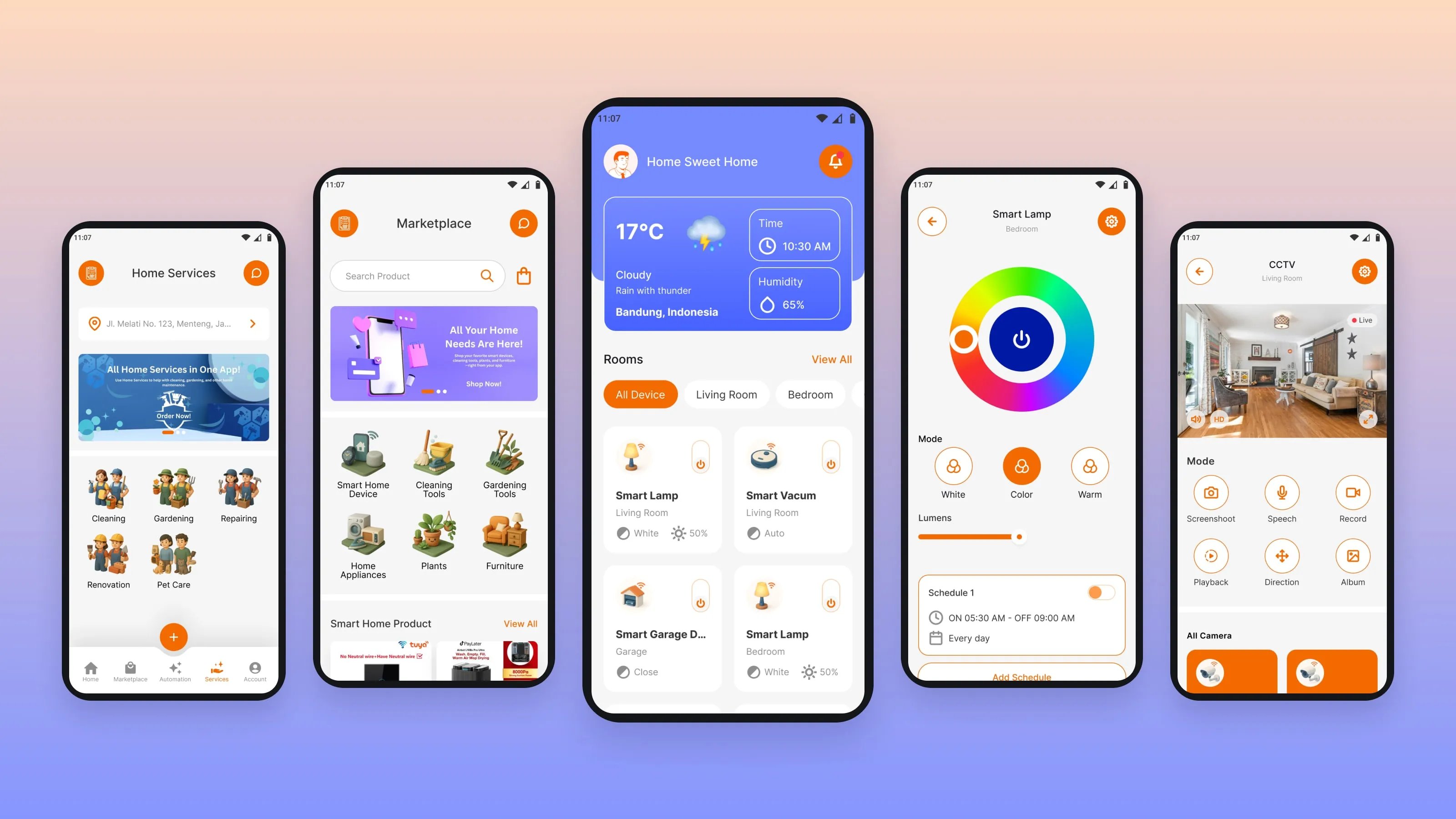
This super app puts three things in one place: controlling smart devices, shopping for smart home products, and booking home services such as installation and maintenance.
02 / Problem
Three product areas, one small screen.
- 5 device brands
- BARDI, Tuya, DMSS, Airbot and Solarman each have their own features and terms.
- Different controls
- A lamp, an air conditioner and a CCTV camera need very different controls.
- Shopping
- It had to feel familiar.
- Home services
- They had to be easy to request from a phone.
- One journey
- Buying, installing, connecting and maintaining a device should feel connected.
- Tight timeline
- 100+ screens in 14 days.
03 / My role
I was the UI/UX designer, hired as a freelancer.
- Screens
- I designed 100+ screens across 3 core modules in 14 days.
- Structure
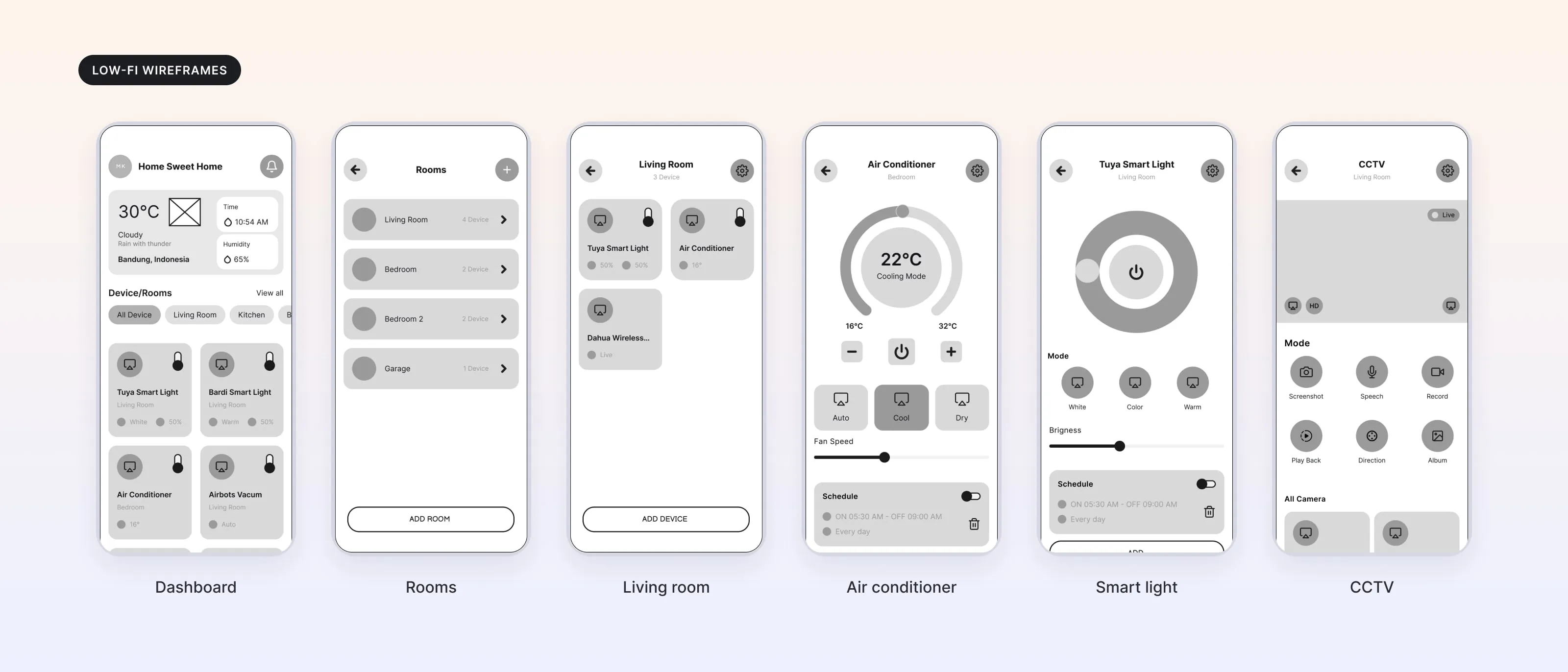
- I set the app structure and key user flows with low-fidelity wireframes first.
- UI design
- I designed the high-fidelity UI and the color system.
- Client feedback
- I ran feedback sessions with the client team at Bimaselindo.
- Handoff
- I delivered interactive Figma prototypes and design documentation.
04 / Process
Wireframes first, then one pattern for every device.
- 01
Wireframes first.
With 14 days, I fixed the app structure and the key flows in low-fidelity wireframes before any visual design.
- 02
Organize by home, not by brand.
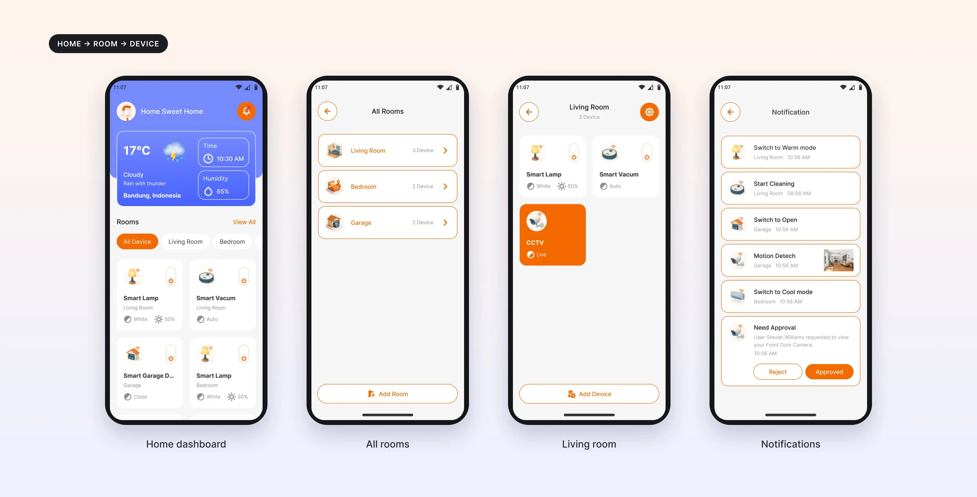
Instead of grouping devices by manufacturer, I used the user's home: Home → Room → Device. It is closer to how people think about their home.
- 03
One pattern, many devices.
I designed one control pattern that every device type follows, with room for each device's own functions.
- 04
Check with the client.
I ran feedback sessions with the Bimaselindo team to check the feature logic and refine the flows before handoff.
05 / Solution
Control, shop and services in one app.
Home dashboard.
Rooms, connected devices and their state on one screen, with a power toggle on every device card. Notifications show what changed, and ask for approval when someone wants to view a camera.
Device controls.
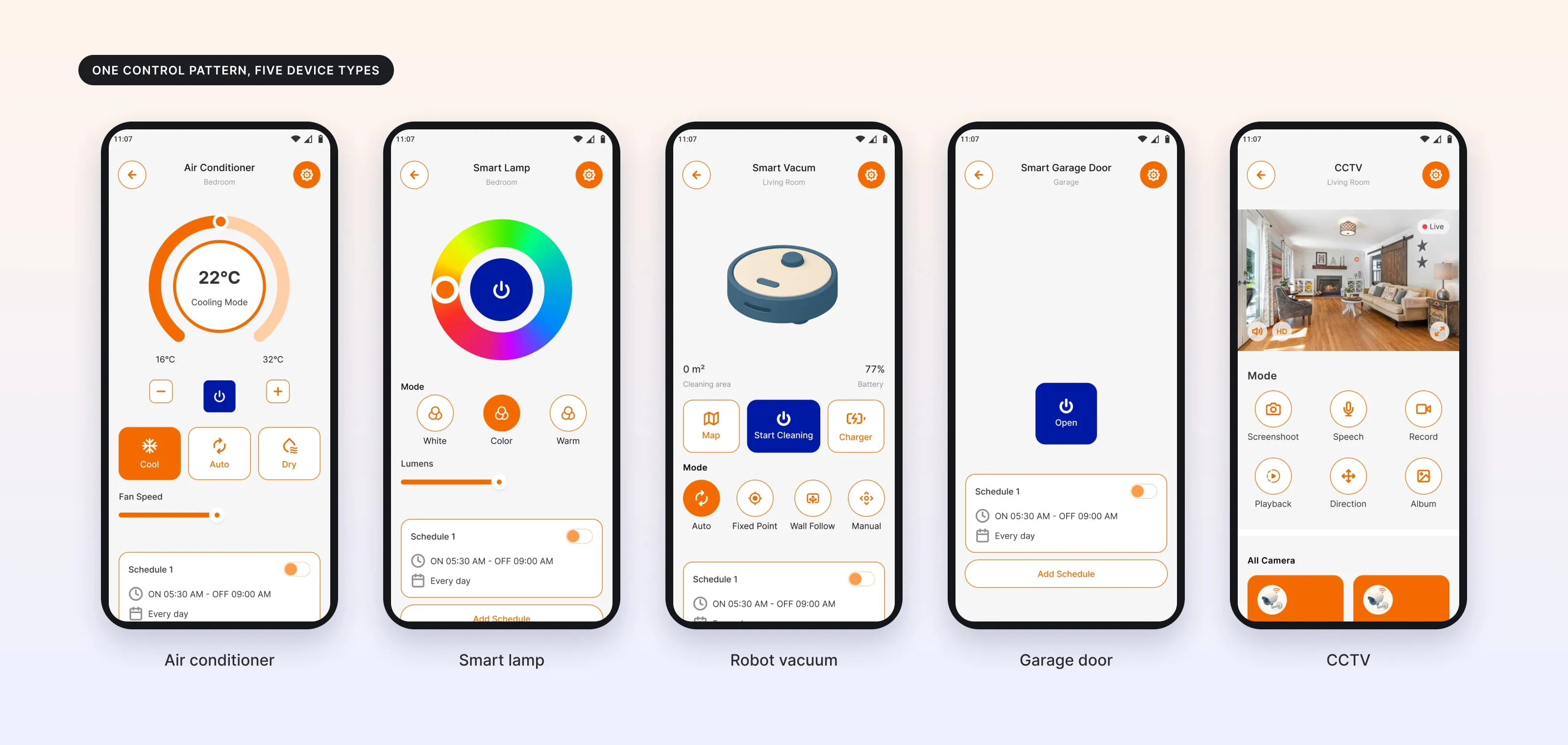
- Air conditioner
- Temperature, cool, auto and dry modes, fan speed and a schedule.
- Smart lamp
- Power, color, white or warm light, brightness and a schedule.
- Robot vacuum
- Start cleaning, map, charger, cleaning modes and a schedule.
- Garage door
- Open or close, with a schedule.
- CCTV
- Live view, screenshot, speech, recording, playback and camera direction.
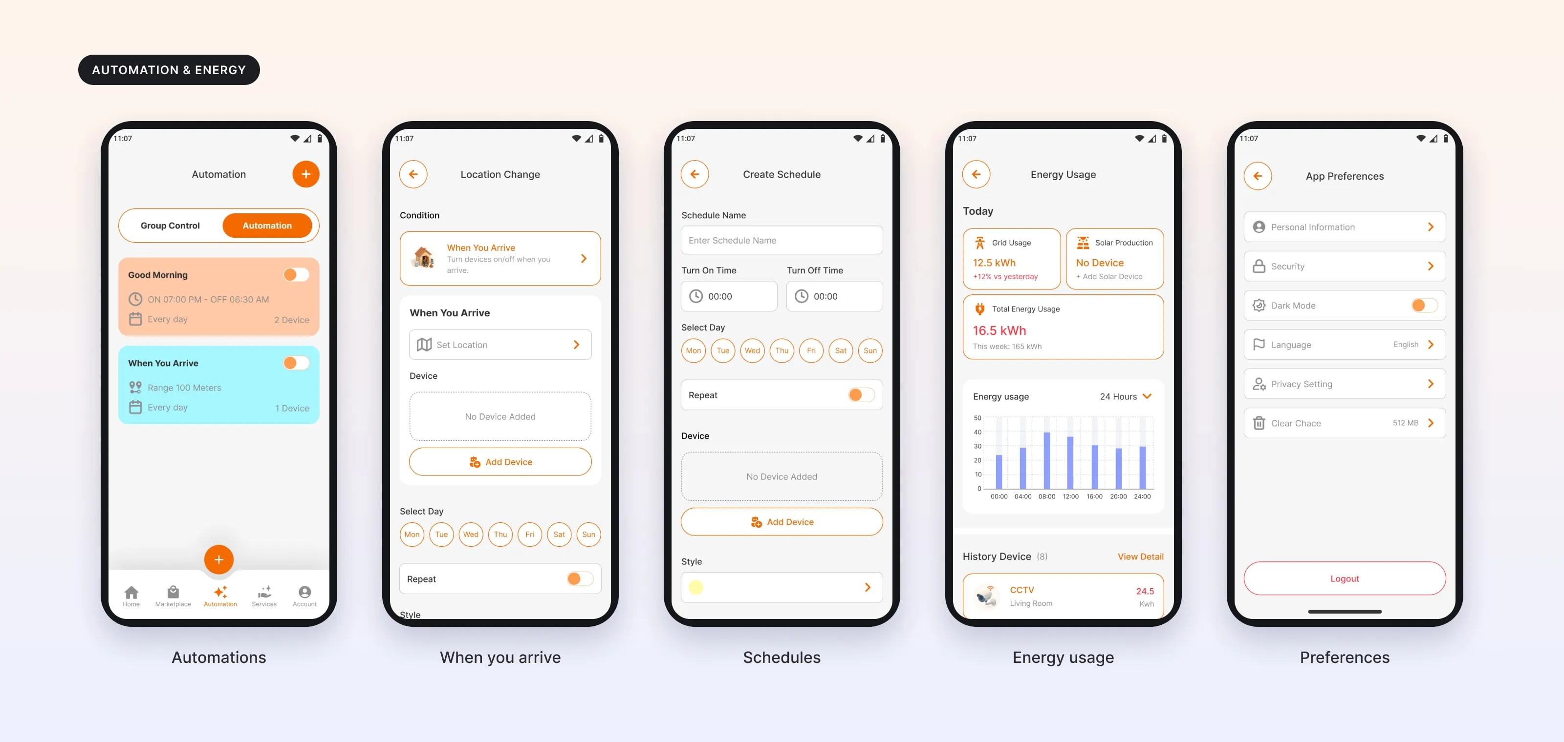
Automation and energy.
Schedules, group control and location rules like "When you arrive" or "If you leave" change several devices in one action. An energy screen shows the use for today and per device.
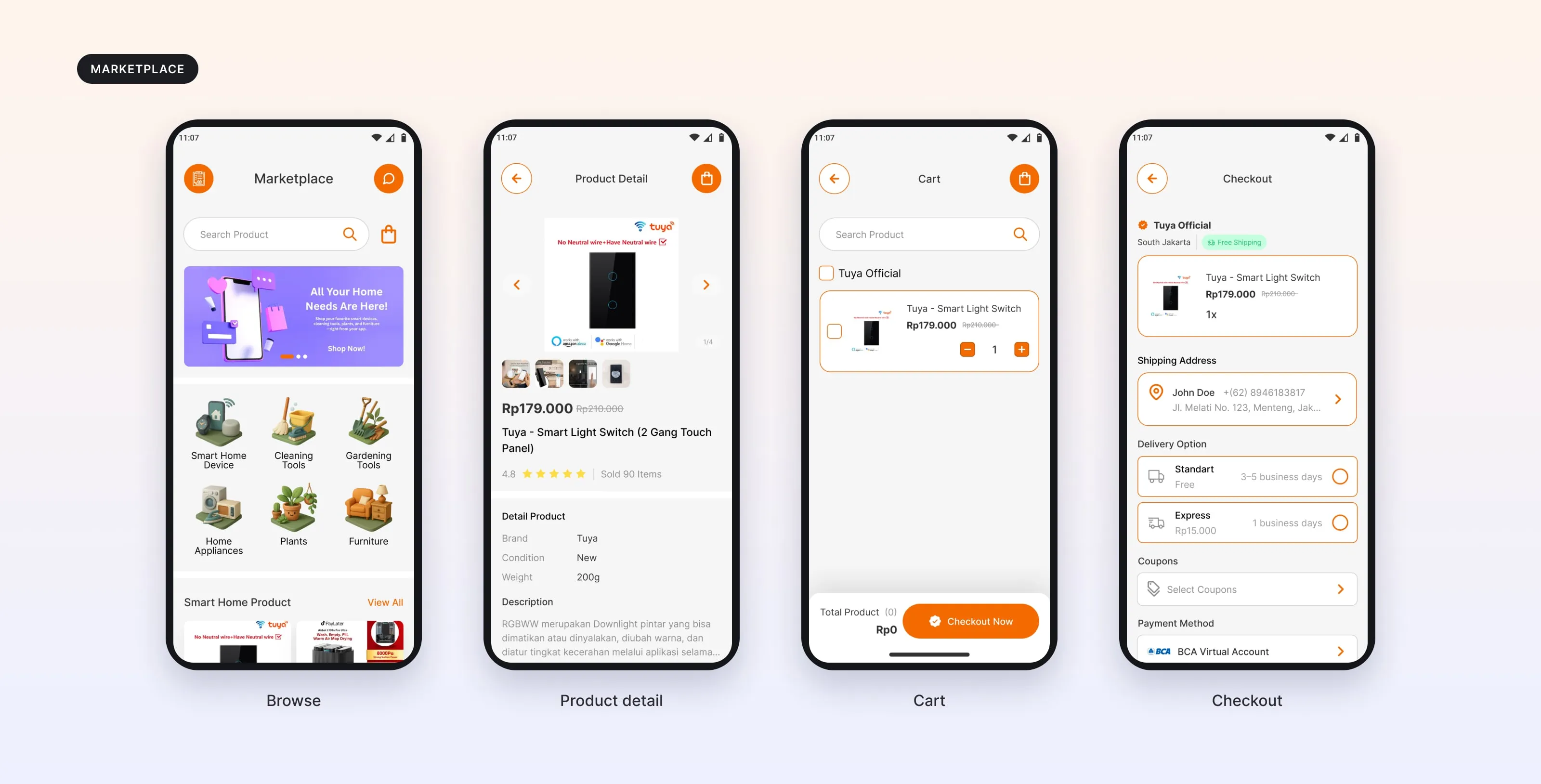
Shop.
Categories, product details, cart and checkout, using familiar mobile shopping patterns.
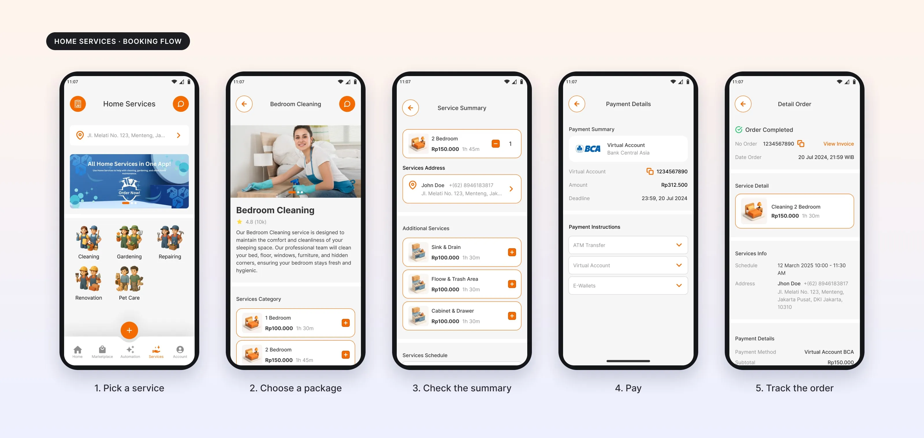
Home services.
Booking a service takes five steps: pick a service, choose a package, check the summary, pay, and track the order.
Connected journey.
Discover → Buy → Install → Connect → Control → Maintain, all in the same app.
Built for one hand.
Bottom navigation, bottom sheets, large touch targets and clear device states.
06 / Result
What I handed over.
100+
screens
14
days
3
modules: smart home, shop, services
- Devices
- Devices from 5 brands in one structure.
- Handoff
- Interactive prototypes and design documentation.
- Components
- Device cards, product cards, service cards, toggles, sliders and bottom sheets.
What I took from it
Connect the whole journey, not just the devices.
A smart home app is not only about controlling devices. It is about the whole journey of living with them.