01 / Context
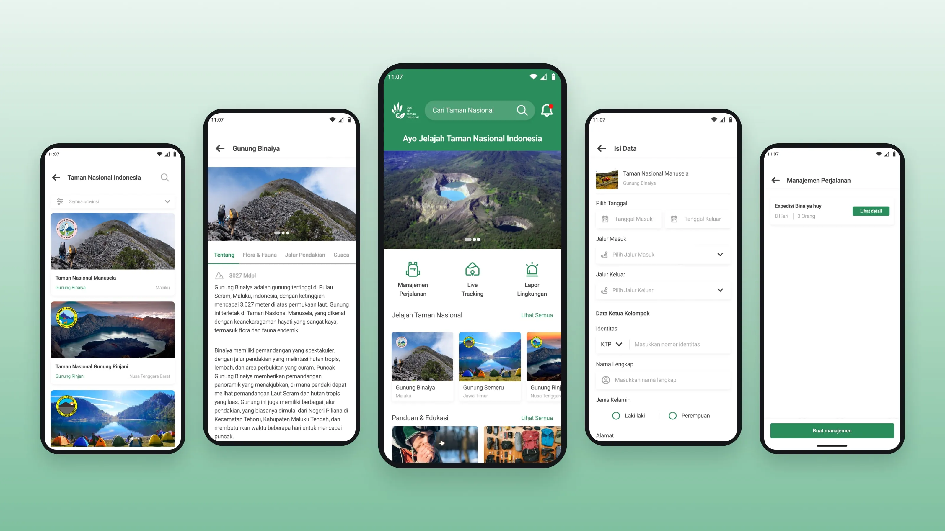
SimaksiKu is a mobile app concept for registering a climb and learning about the national parks in Indonesia.
Indonesia has 56 national parks, and many of them are popular hiking spots. To climb there, hikers need a SIMAKSI, an entry permit for a conservation area. This was my final project for the Hacktiv8 UI/UX bootcamp.
I set three goals: make the SIMAKSI registration easier with one digital system, teach hikers about conservation, and reduce the impact of hiking with education and a way to report trash or damage.
02 / Problem
Registration is scattered, and the trail pays the price.
- Scattered registration
- Hiking registration is not managed in one place.
- Hard-to-find information
- Up-to-date information for hikers is hard to get.
- Damage on the trail
- Hiking activity puts the environment at risk.
- Unclear documents
- Hikers need to know which documents to prepare, like an ID card and a health certificate.
- No draft
- The registration could not be saved and finished later.
03 / My role
I did this final project on my own, from research to the prototype.
- Research
- I mapped the registration journey and its pain points.
- Ideation
- I used Crazy 8 and paper sketches to explore the main screens.
- Structure
- I planned the content with a UI mindmap and drew the user flows.
- Design
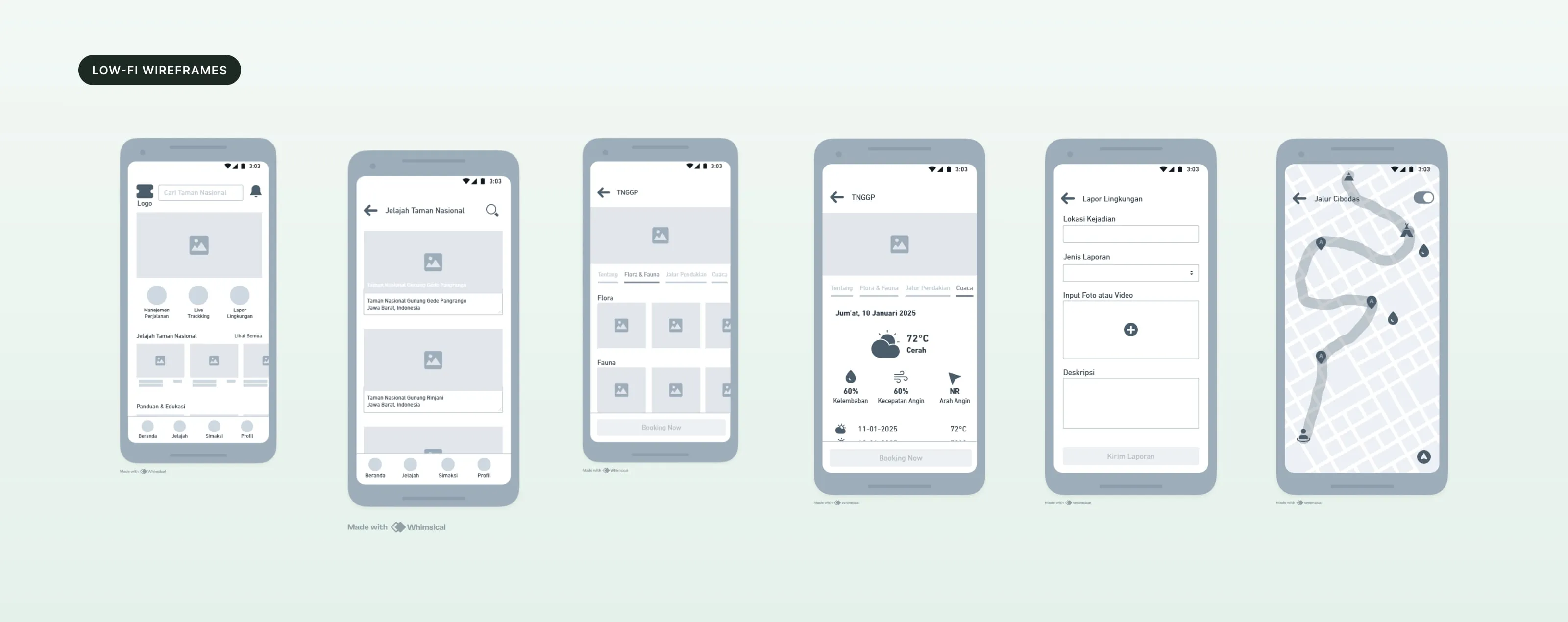
- I made low-fi wireframes in Whimsical, then the design system and the final UI in Figma.
- Testing
- I ran usability testing on the prototype with Maze.
04 / Process
Journey, sketches, structure, then screens.
- 01
Map the journey first.
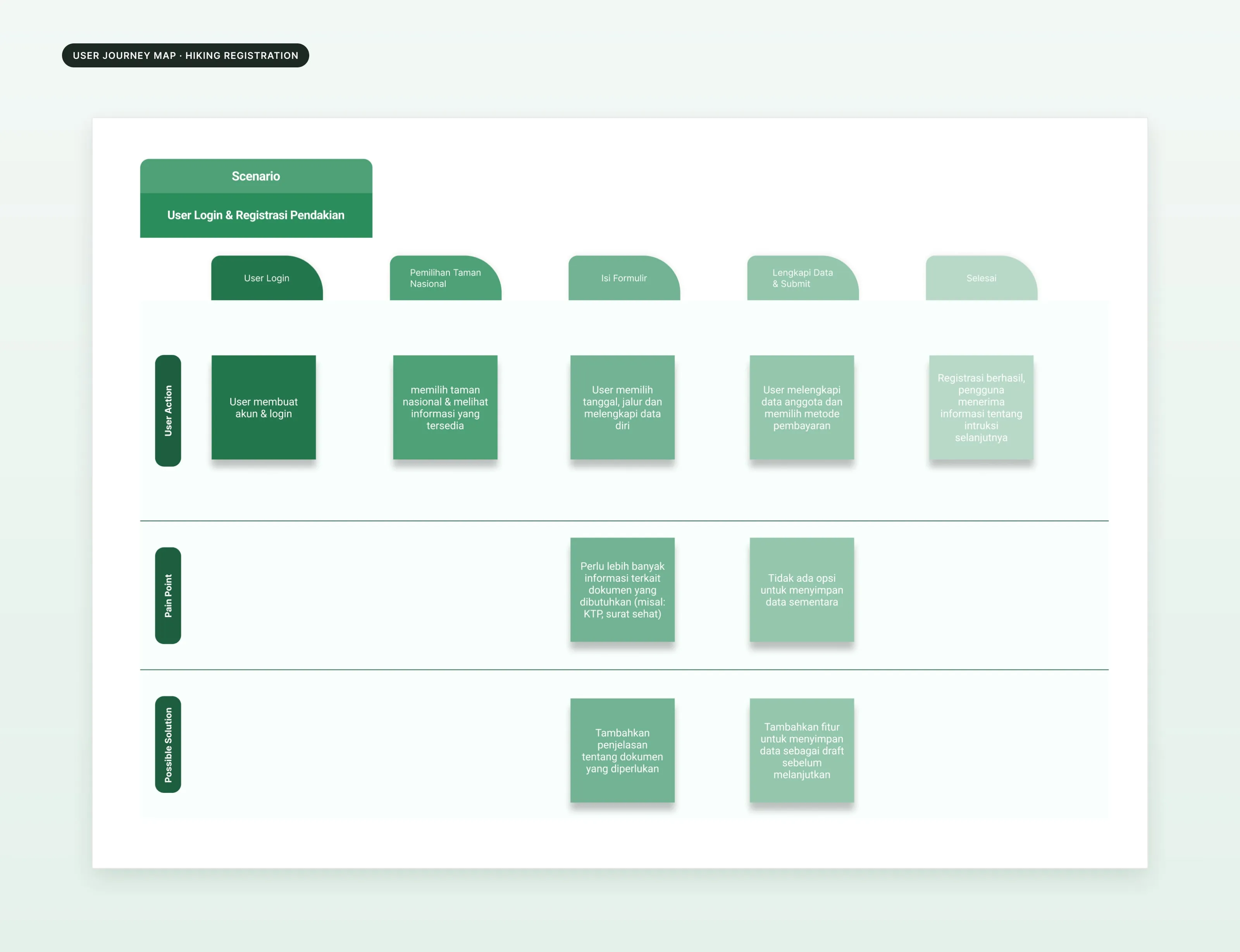
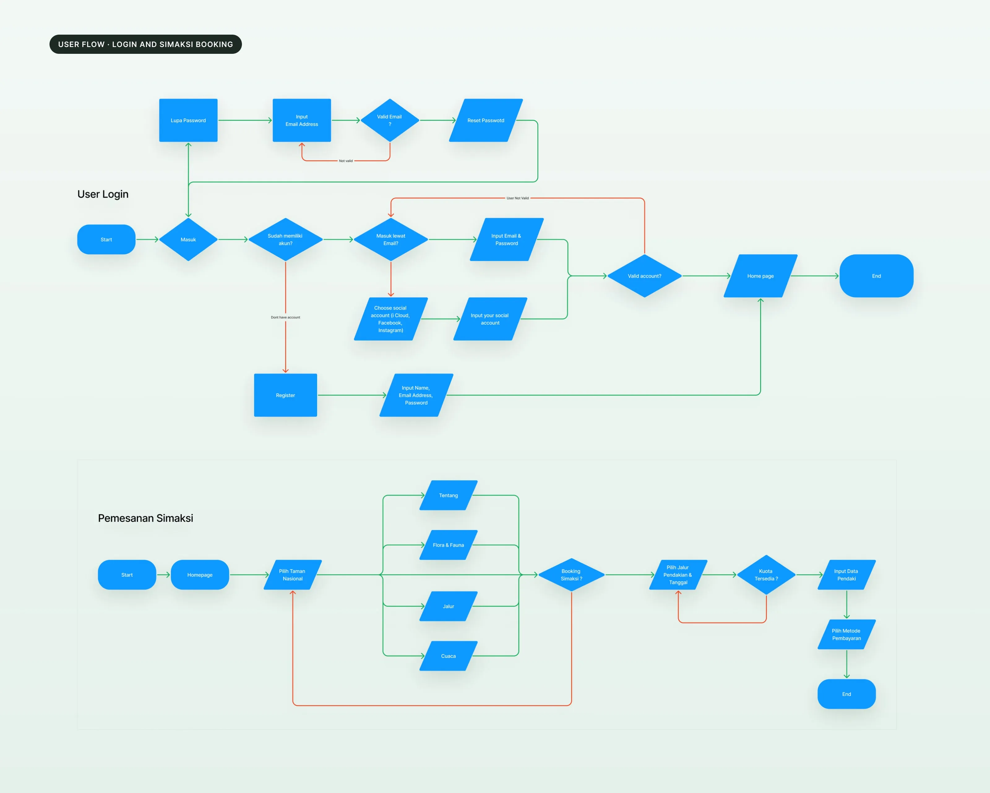
I mapped how a hiker registers for a climb, from logging in to the end of the booking, and wrote down where it breaks. Two pain points stood out: people need clearer information about the documents to bring, and there is no way to save the form and finish it later.
- 02
Sketch fast, then pick.
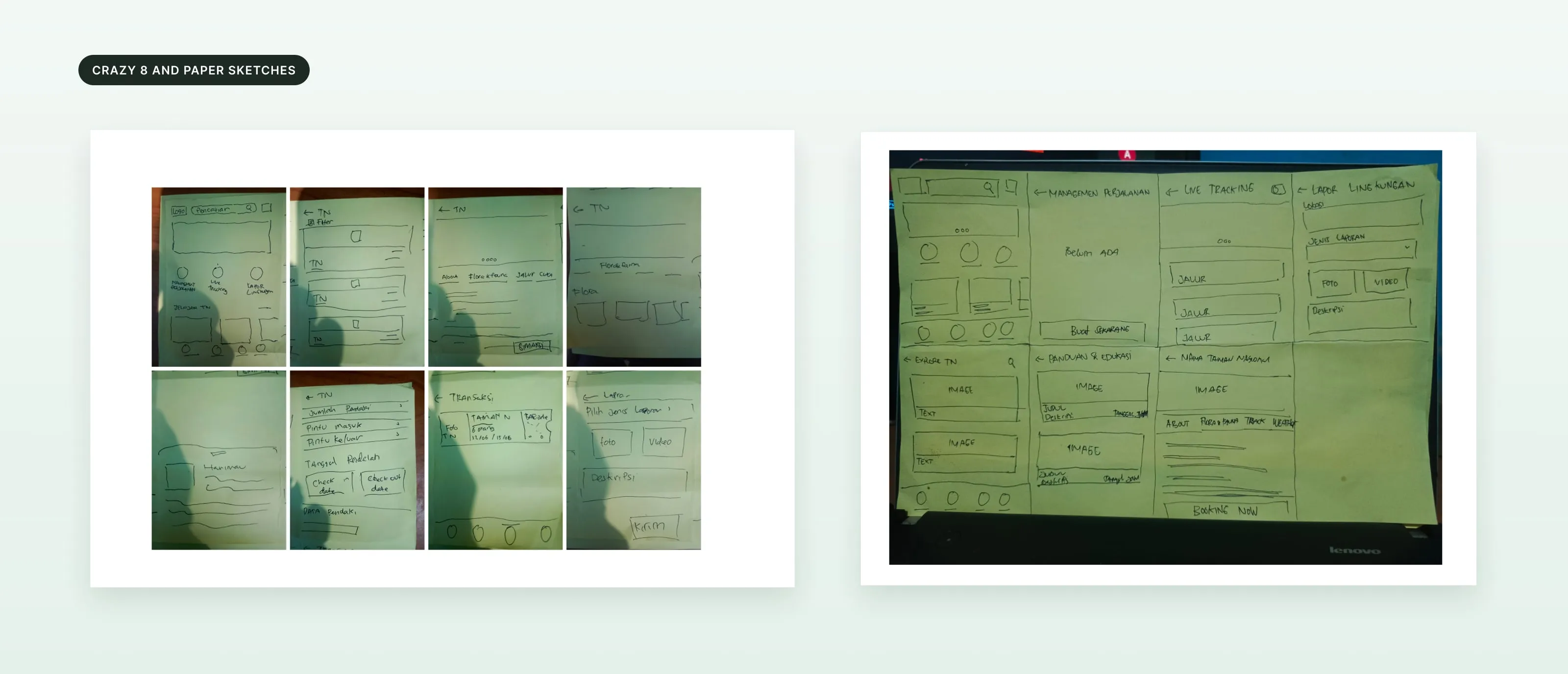
I used Crazy 8 to sketch ideas quickly, then drew the main screens on paper: home, explore, park detail, trip planning, live tracking and the environment report.
- 03
Plan the content and the flows.
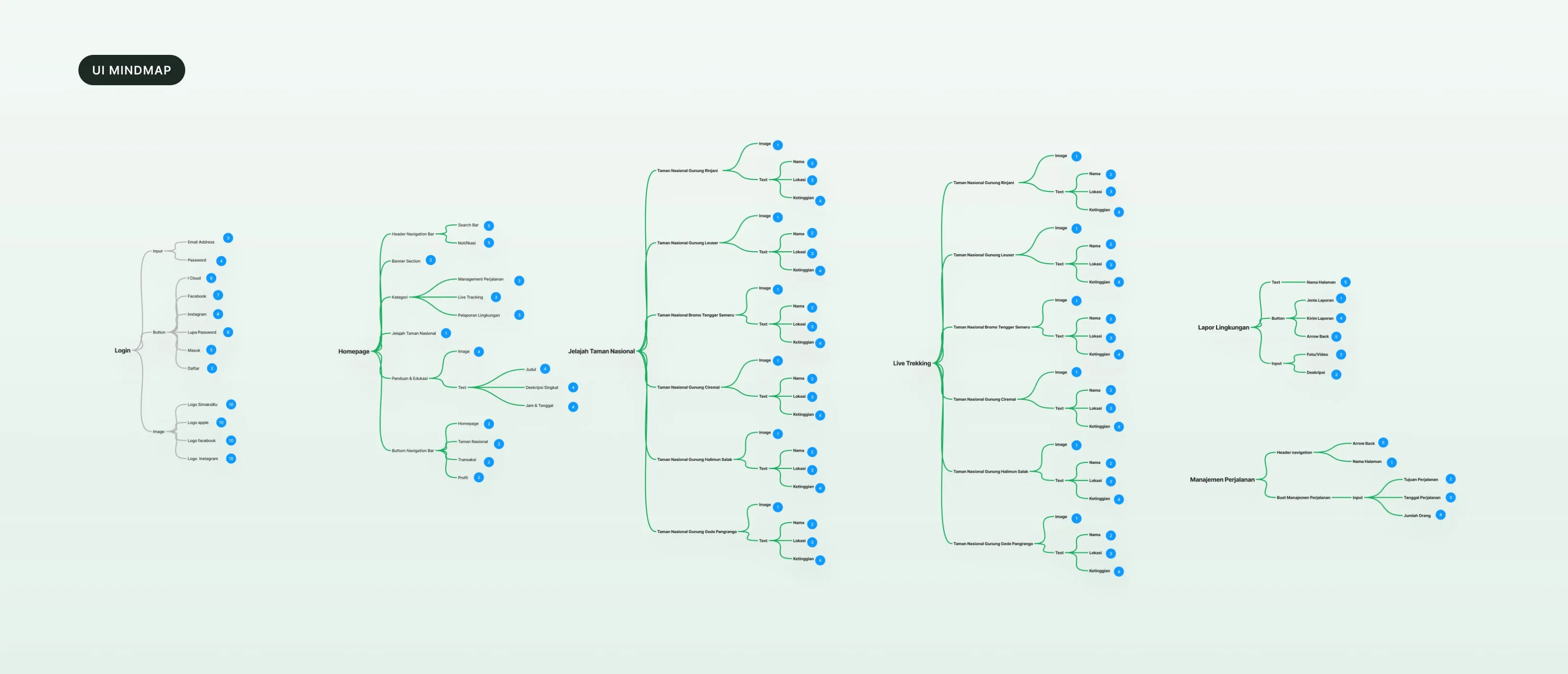
A UI mindmap listed what each screen needs. The user flows covered logging in and booking a SIMAKSI, including the checks for a valid account and an available quota.
- 04
Wireframes, then the UI.
I built low-fi wireframes in Whimsical, then set up the colors, type, spacing and components in Figma before the high-fidelity screens.
- 05
Test with users.
I tested 4 scenarios in Maze with 3 hikers, one at each experience level: extreme, semi-extreme and non-extreme. Each task was scored from 1 (could not finish it) to 3 (finished quickly, with no trouble).
05 / Solution
Explore, book, plan and track in one app.
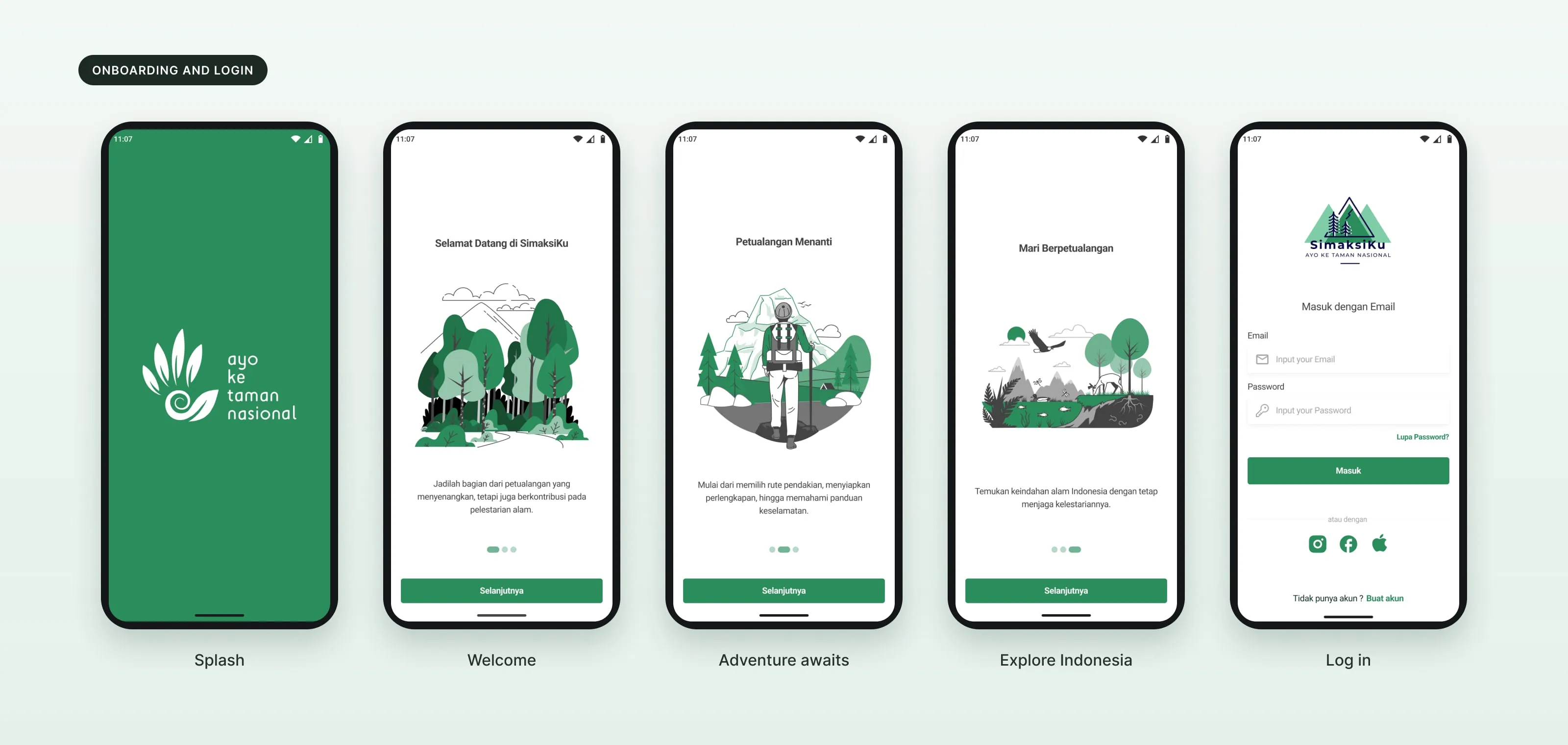
Onboarding and login.
Three onboarding screens introduce the app. People can log in with email or a social account.
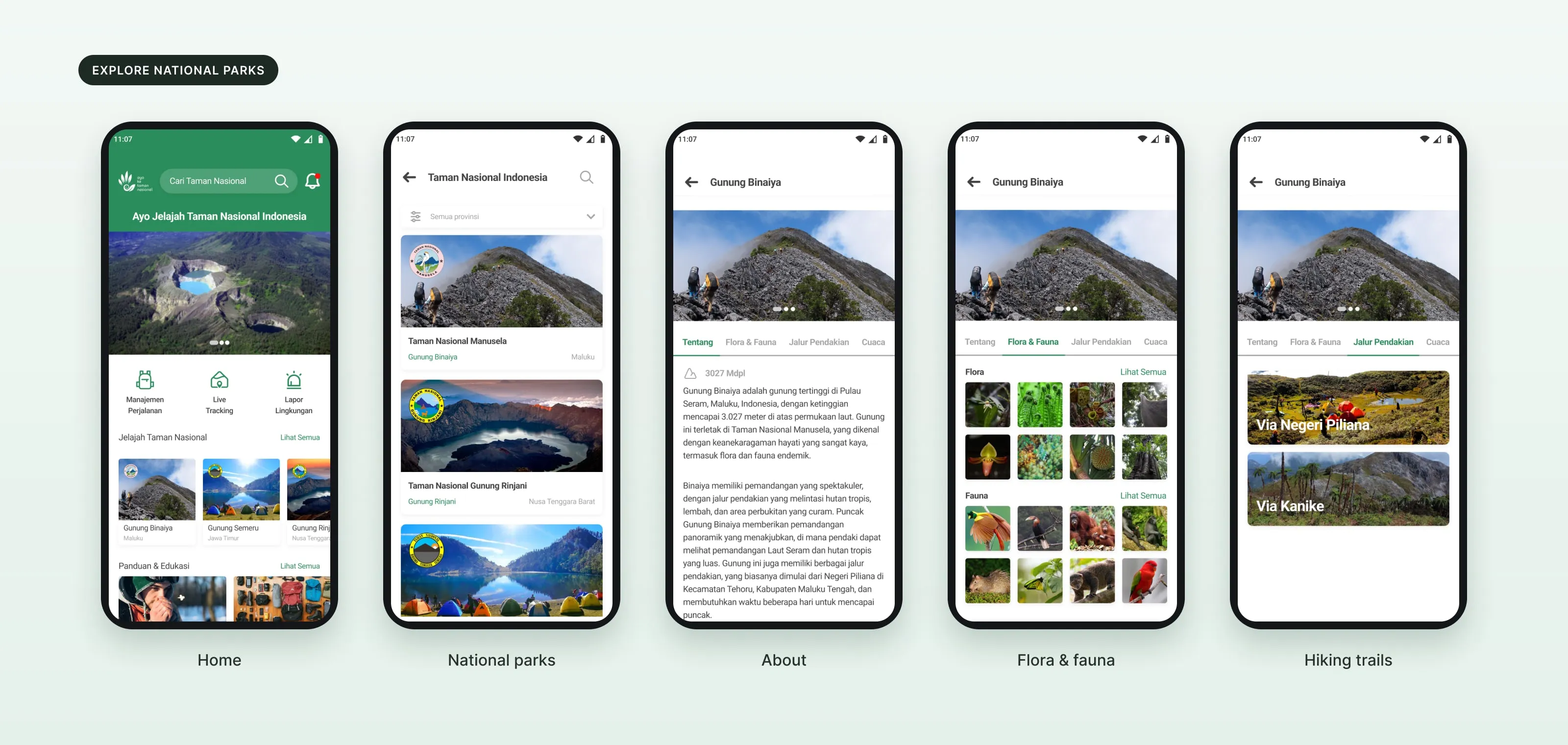
Explore national parks.
Each mountain has four tabs: about, flora and fauna, hiking trails and weather.
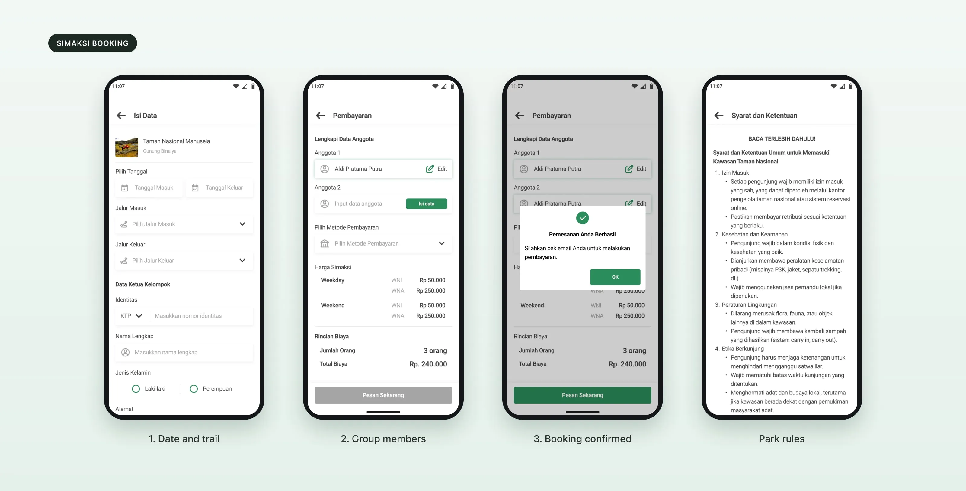
Book a SIMAKSI.
Pick the dates and the entry and exit trails, fill in the group leader, add the members and choose how to pay. Prices are shown per person, for weekdays and weekends, and for local and foreign visitors.
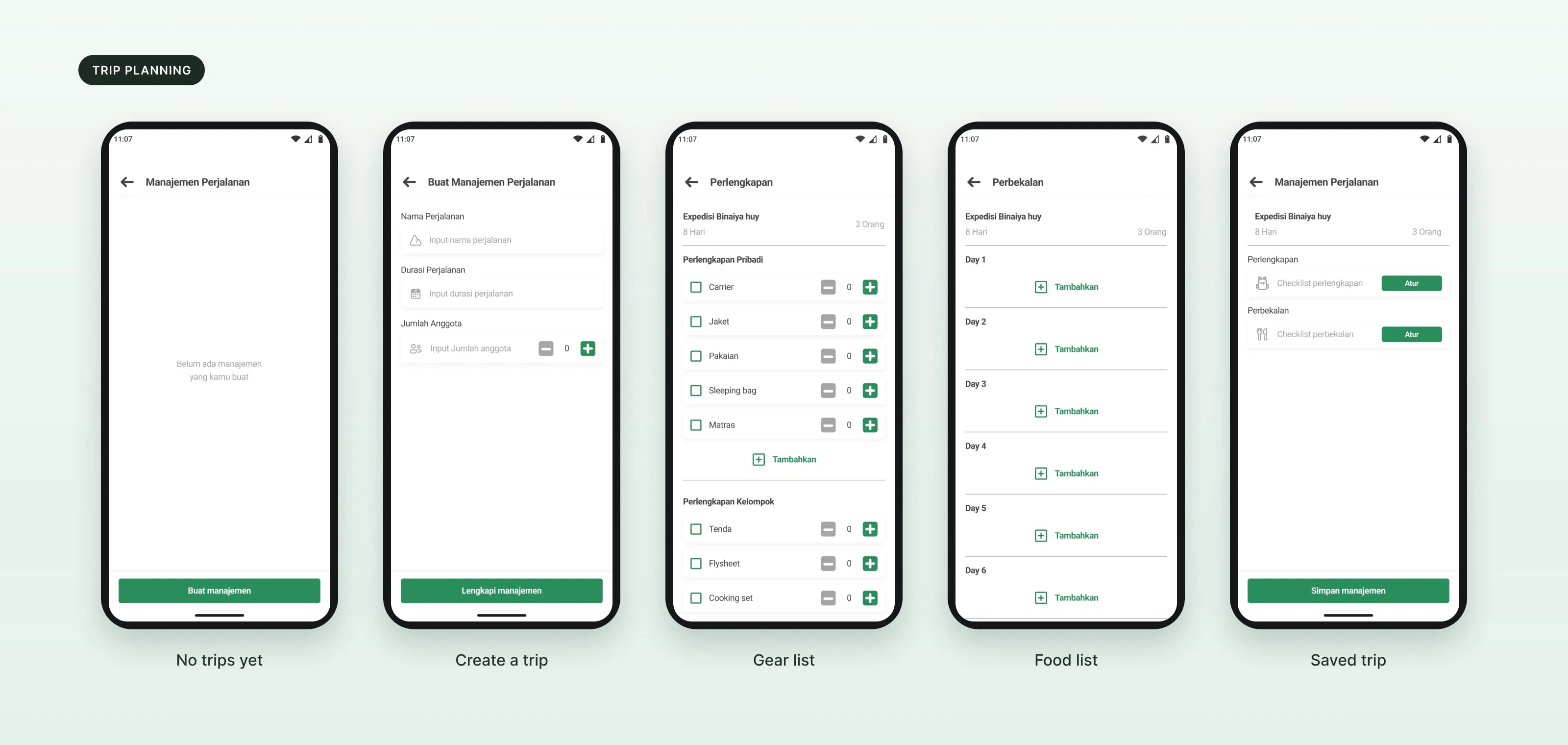
Plan the trip.
A trip has a name, a length and a group size, with a gear checklist and a food plan for each day.
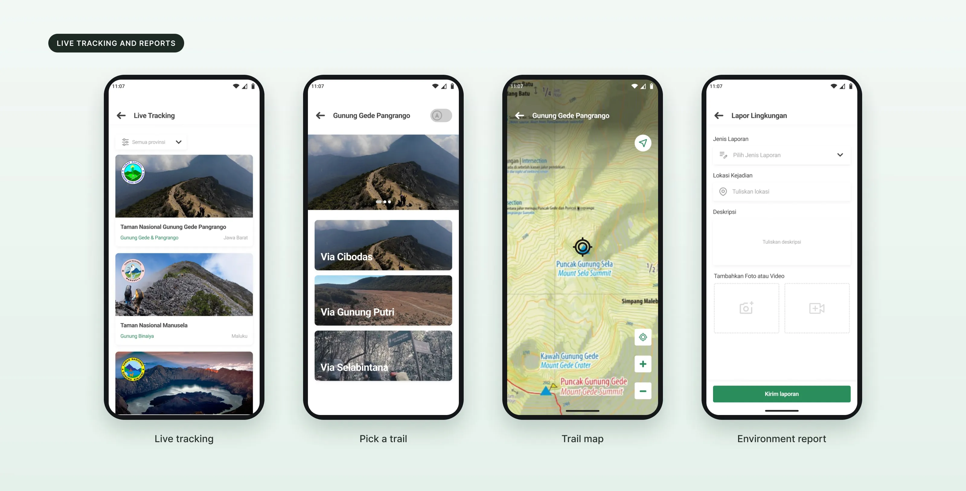
Live tracking and reports.
Hikers pick a trail and follow it on a map. If they see a problem, they can send an environment report with a location, a description and a photo or video.
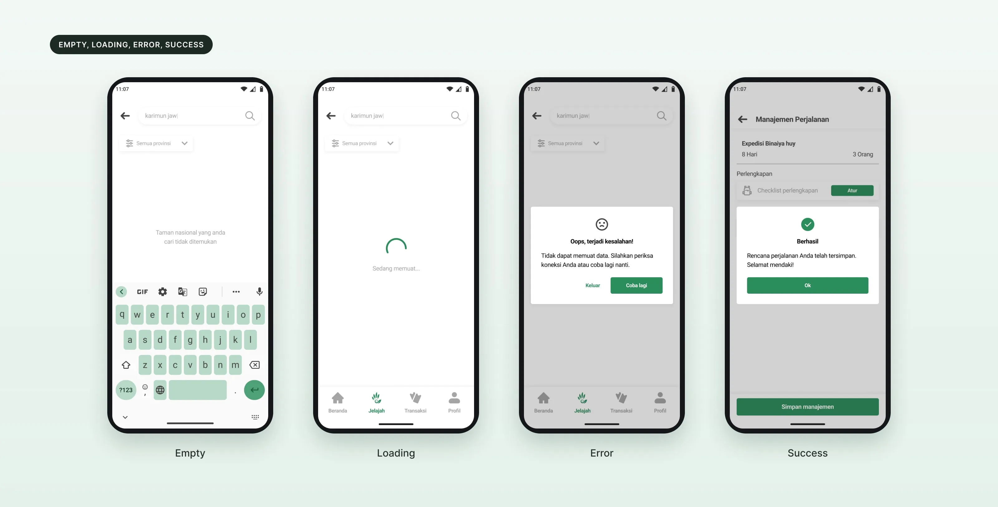
Every state designed.
Empty, loading, error and success states, so people always know what is happening.
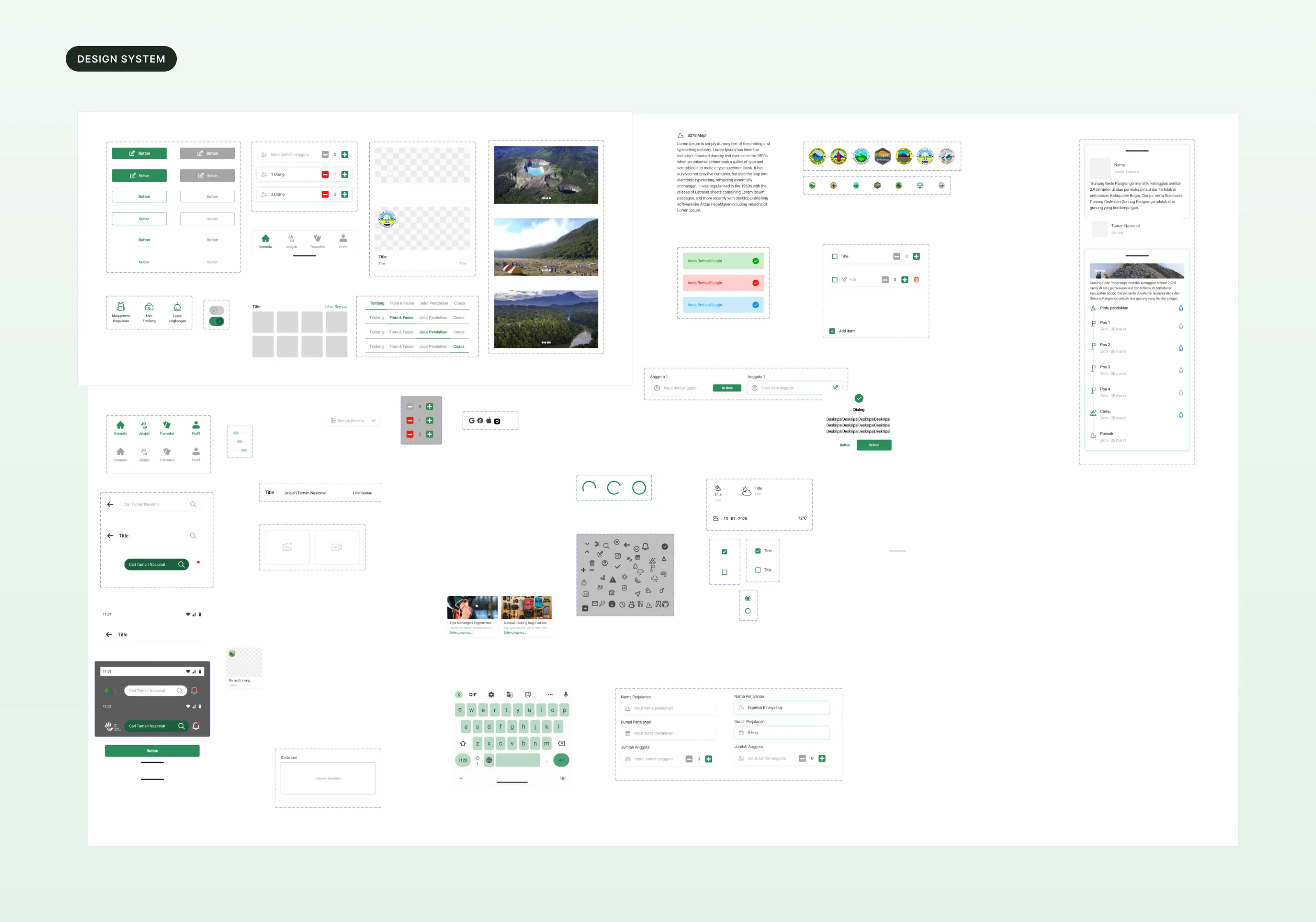
A design system.
Colors, type, spacing, shadows and components, set up in Figma before the final screens.
06 / Result
What I handed over.
4
scenarios tested in Maze
3
hikers: extreme, semi-extreme, non-extreme
11
of 12 scores were 3 out of 3
- Registration
- All 3 hikers finished it with no trouble. Hikers found it easy to understand.
- Trip planning
- Experienced hikers valued it most. The non-extreme hiker could not finish this task.
- Live tracking
- Positive for every level, especially on new or unfamiliar trails.
- Environment report
- Seen as useful, but the visuals and interaction need work.
- Next version
- Document upload, a registration draft, clearer document info, a guide for new hikers, a cost estimate, a weight and trash calculator, a compass, and reports with coordinates, a date and a privacy option.
What I took from it
Experienced hikers found it helpful. Beginners needed more guidance.
The app was easy to use, but the next version needs more complete information, a cost estimate, and more detailed environment reports.