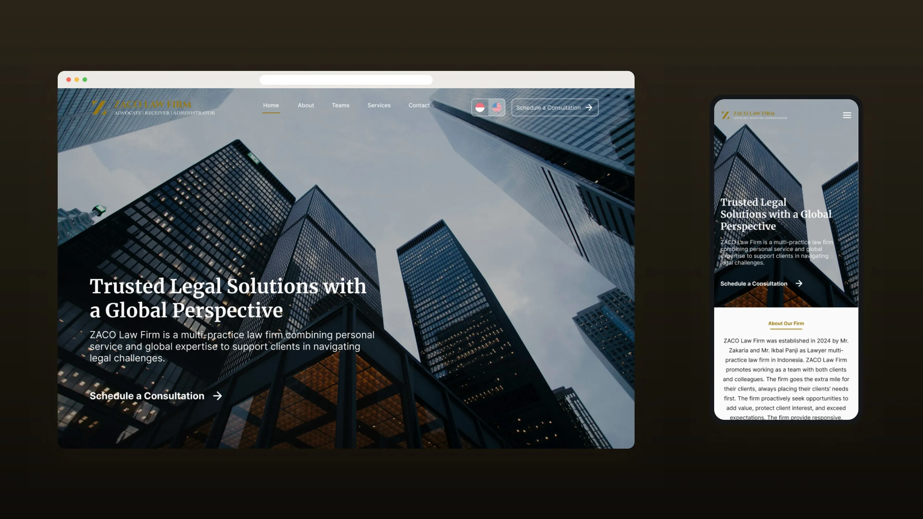
01 / Context
Zaco Law Firm is a Jakarta law firm that offers legal services and dispute resolution support.
It needed a company profile website. For a law firm, the website is often where a potential client first decides whether the firm feels credible. It has to look professional without feeling cold or hard to read.
02 / Problem
Make a law firm feel credible and approachable at the same time.
- First impression
- The site had to look professional from the first screen.
- Services
- Legal services and areas of expertise had to be clear to non-lawyers.
- The team
- Potential clients want to know who they will work with.
- Trust before contact
- Visitors needed enough information to feel comfortable reaching out.
- Next step
- There had to be a clear path toward a consultation.
- Every device
- Desktop and mobile had to feel equally professional.
03 / My role
I was the UI designer on the project.
- Structure
- I set the information architecture.
- Visual direction
- I set the visual direction.
- Pages
- I designed the service and team pages.
- Components
- I built reusable components.
- Handoff
- I prepared a Figma prototype for handoff.
04 / Process
Start with what clients look for.
- 01
Start with what clients look for.
I ordered the site around what a potential client checks when choosing a law firm: who the firm is, what it does, who is on the team, and how to get in touch.
- 02
Three principles.
Credibility, clarity and trust. Every layout decision was checked against them.
- 03
Design a visual system, not single pages.
Typography, spacing, service cards, team profiles and contact sections were set up as reusable patterns in Figma.
05 / Solution
A clear structure, plain services and a visible team.
A clear site structure.
Home, About, Team, Services and Contact. The homepage gives a short version of each: who the firm is, why choose it, its services, the team and how to get in touch.
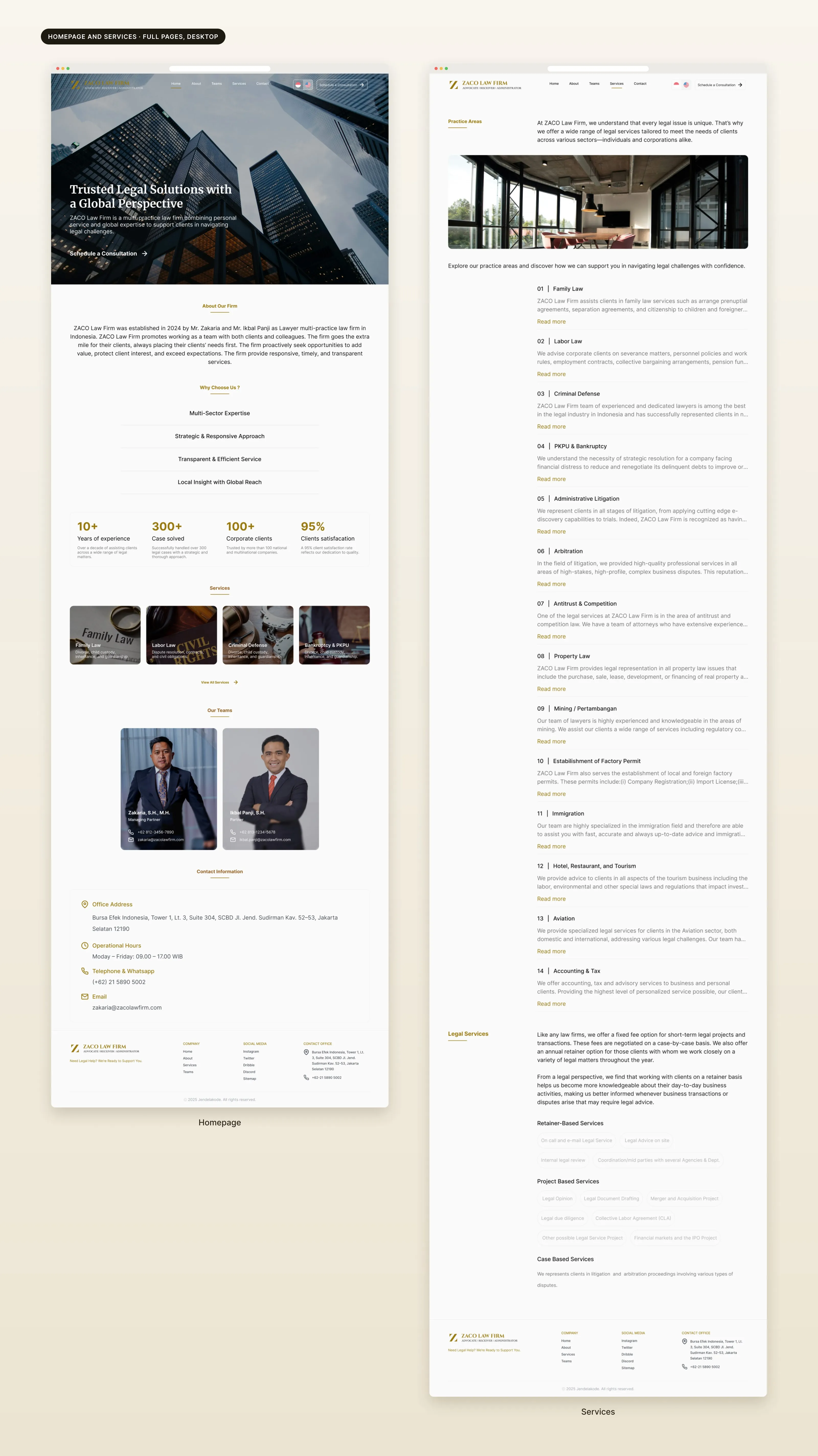
Services in plain steps.
The services page lists 14 practice areas, each with a short explanation and a link to read more, followed by retainer and project-based legal services.
A visible team.
The team page shows each lawyer's photo, role and background, with a phone number and email. The team is one of the strongest trust signals for a law firm.
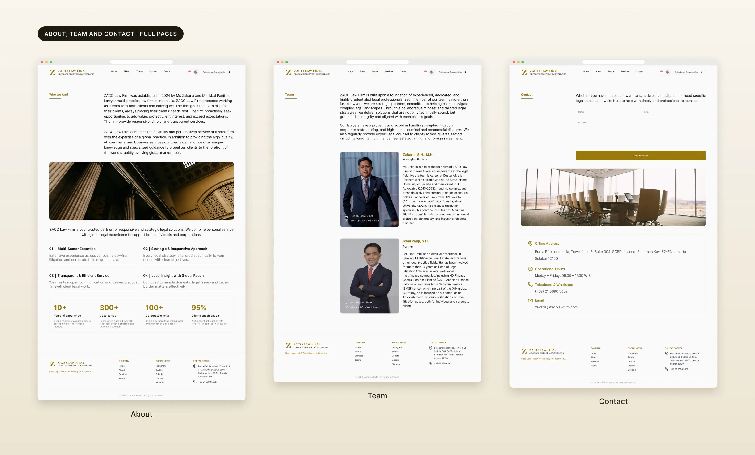
Restrained visual style.
A dark and gold palette, a serif for headlines, structured layouts, generous spacing and few decorative elements.
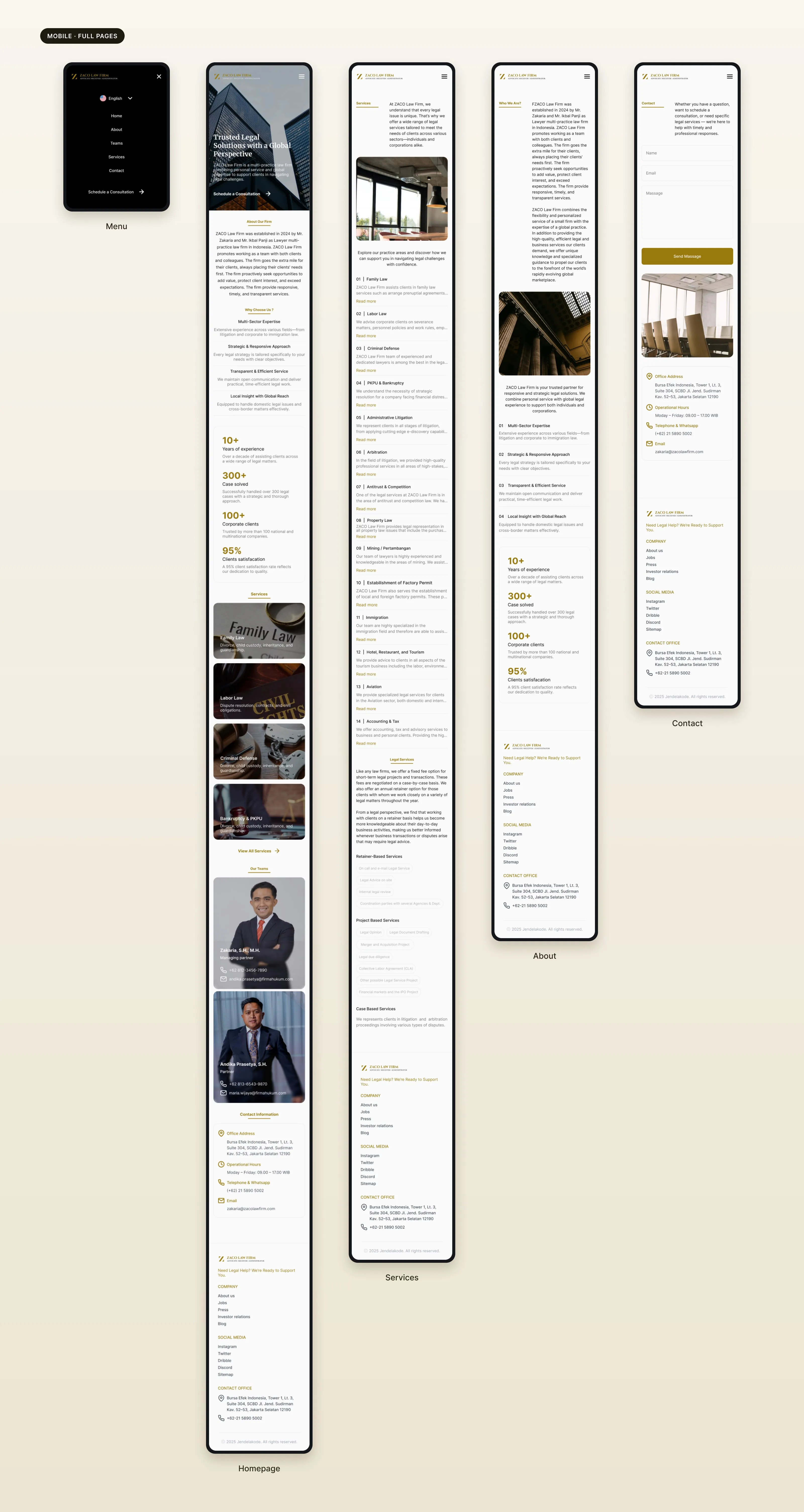
Responsive layouts.
Every page has a tablet and a mobile layout. On mobile, the menu moves into a drawer, and the contact action stays easy to reach.
06 / Result
What I handed over.
~2
weeks
5
pages: home, about, team, services, contact
3
layouts: desktop, tablet, mobile
- Website
- A responsive company profile website.
- Handoff
- Reusable components and a Figma prototype for the developers.
What I took from it
Trust is not only a visual style.
People need to see quickly who the firm is, what it does, who is behind it, and how to reach them.